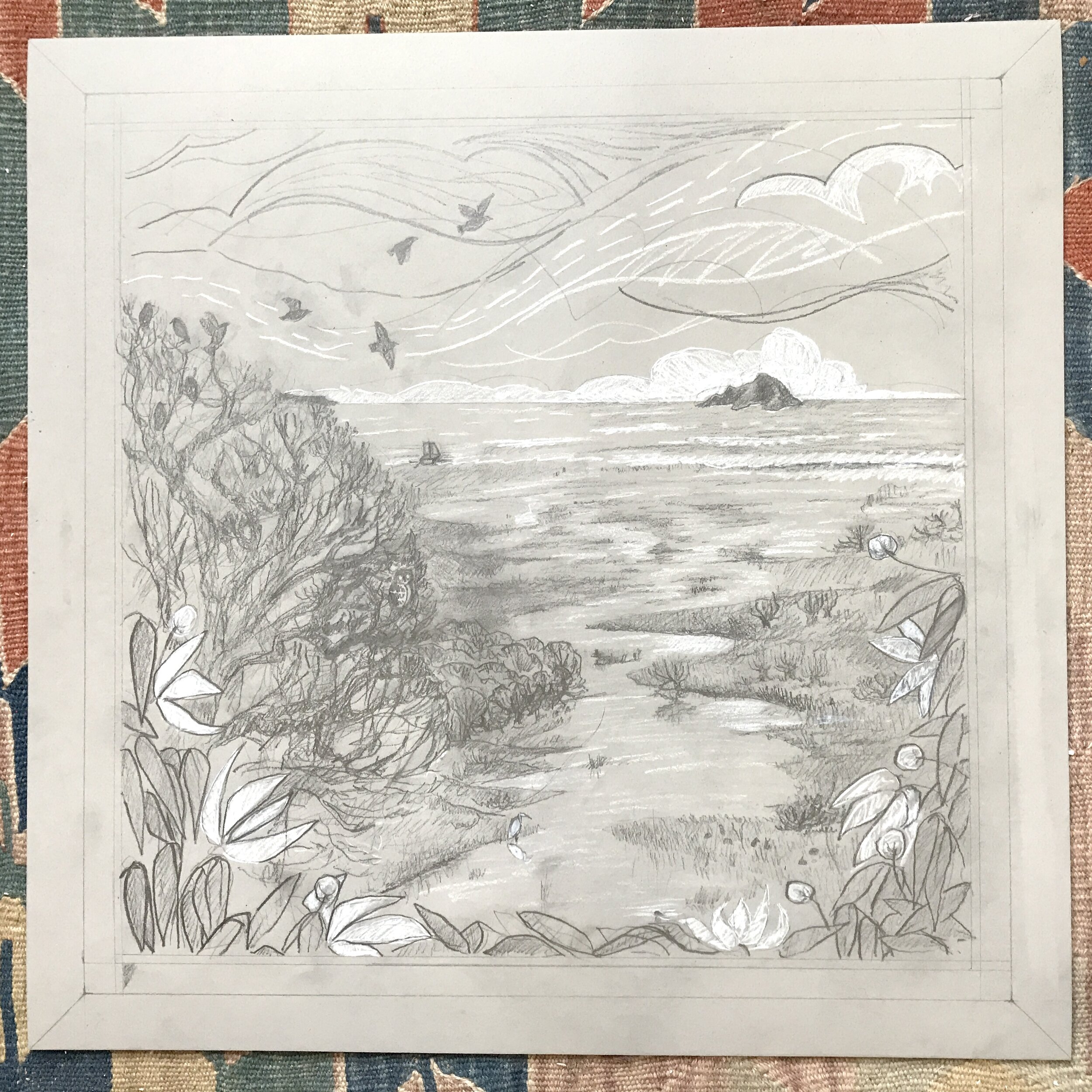
On the Cusp of the Tide
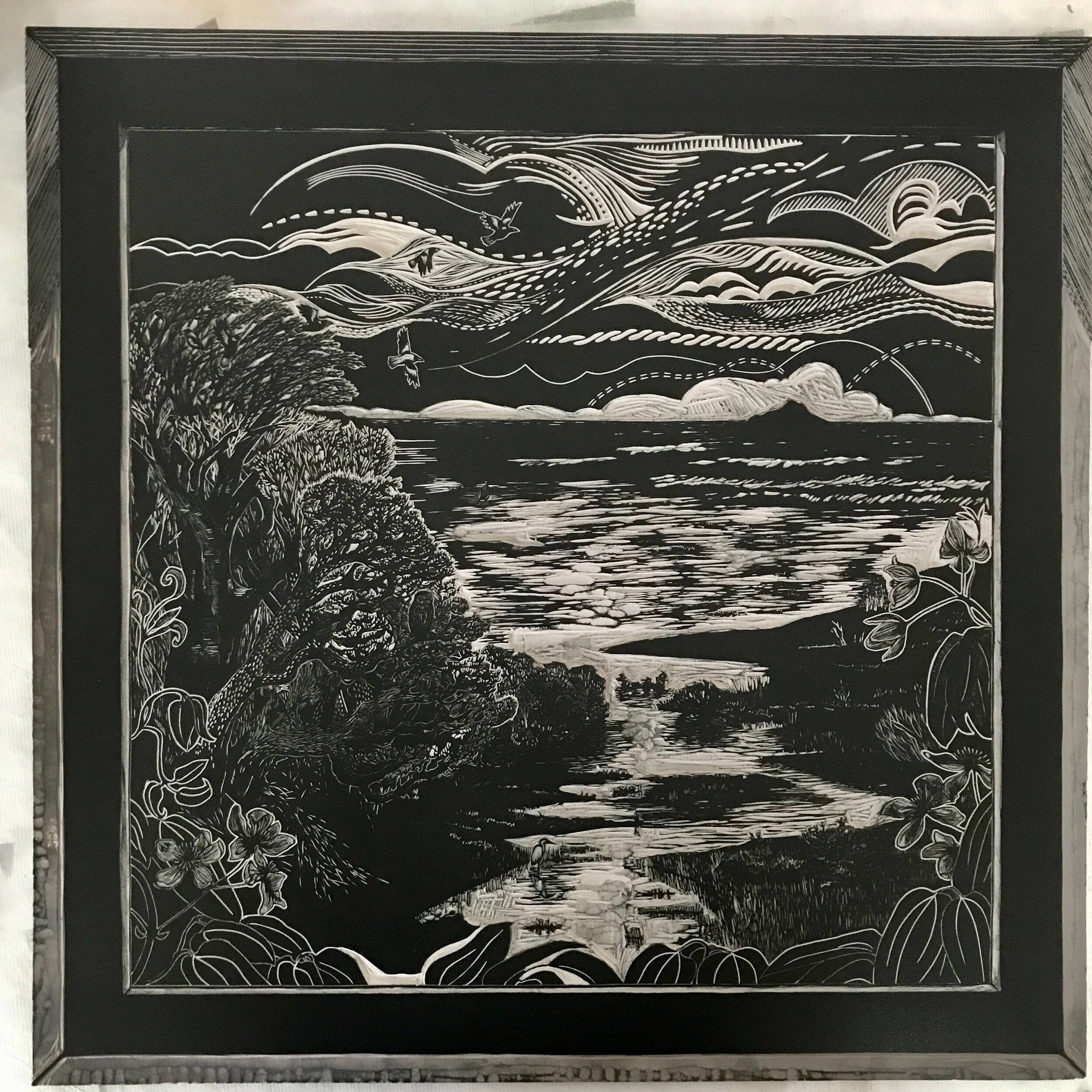
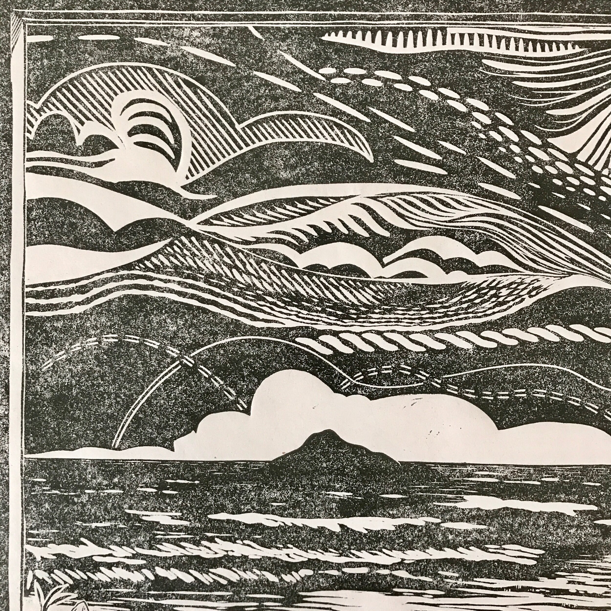
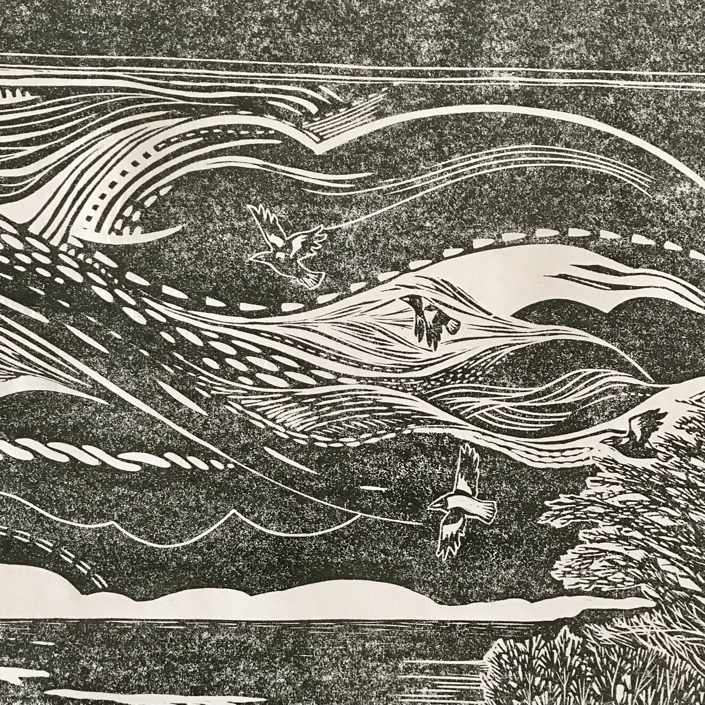
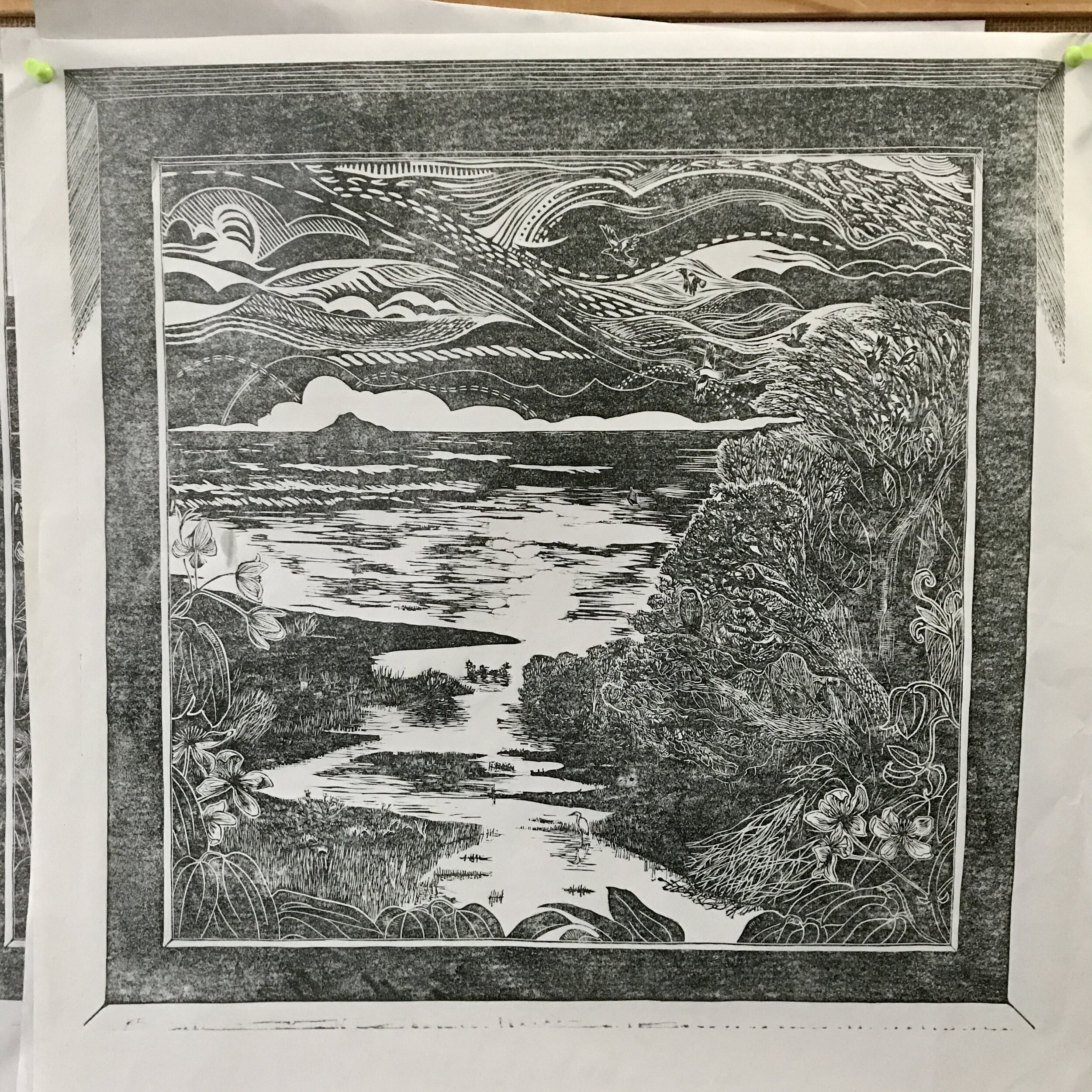
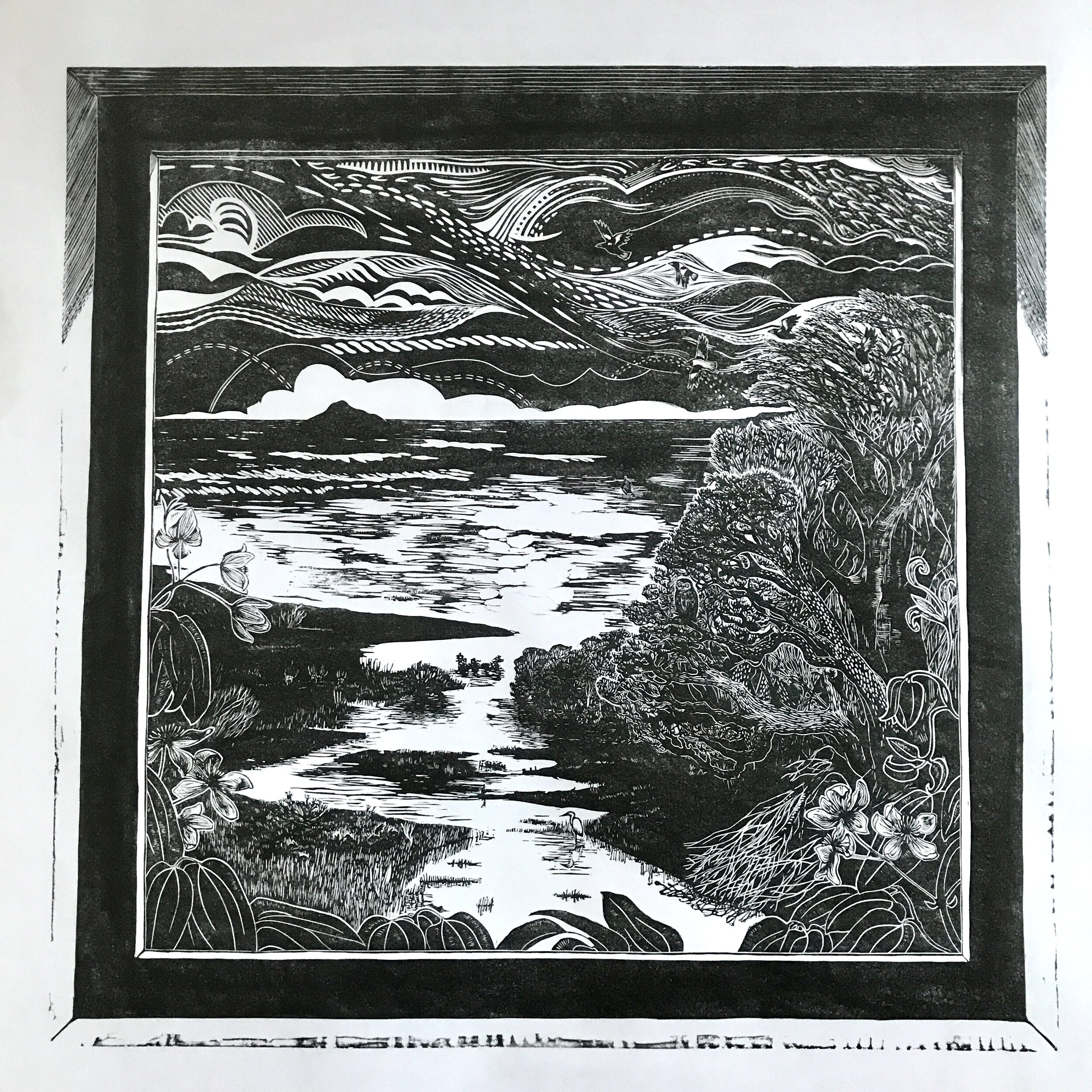
Follow the wetland stream from the window as it flows past woods and rushes to join the sea. A boat bobs on the tideline, and an island beckons just off shore. Wildlife fills each available nook and cranny, and the more you look the more you see.
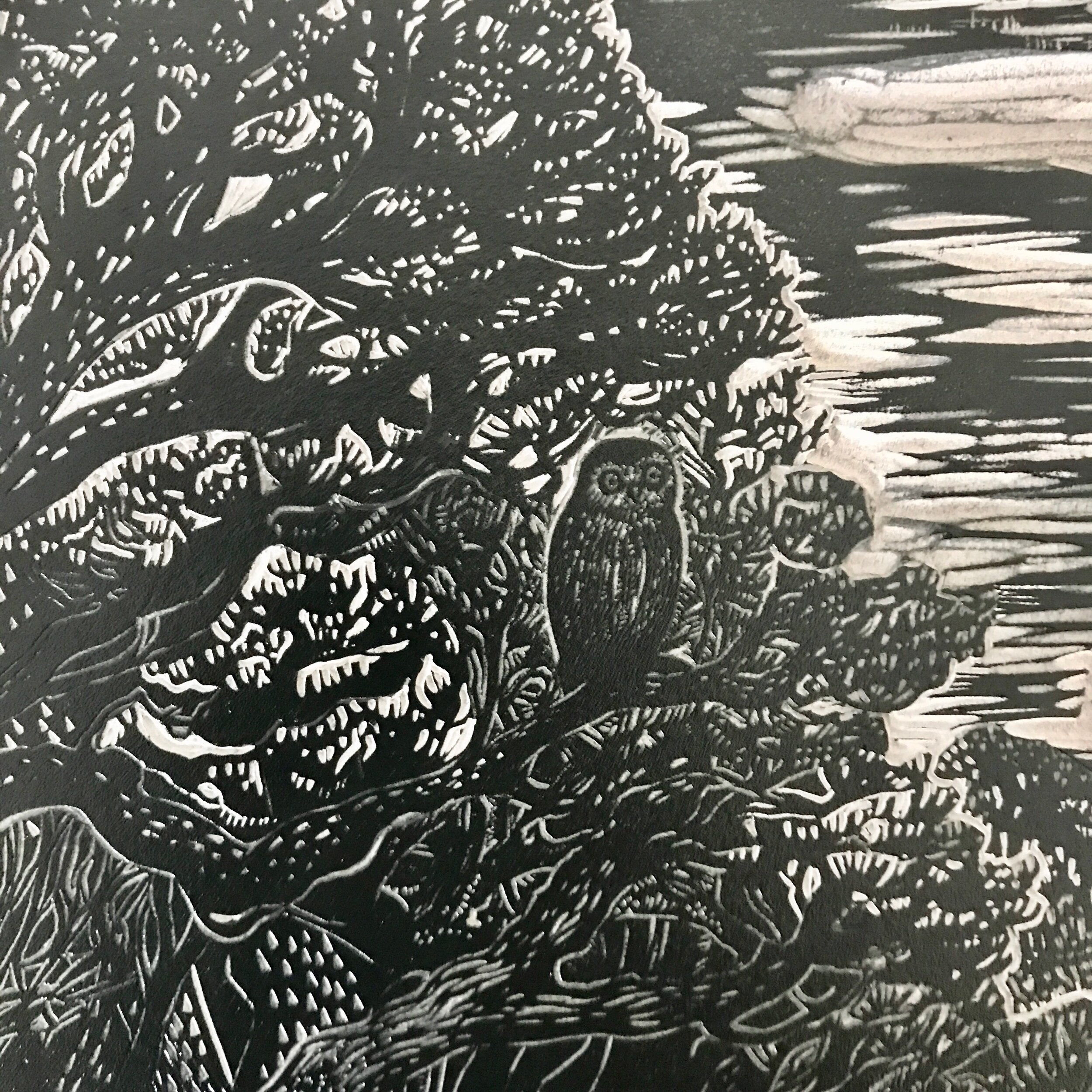
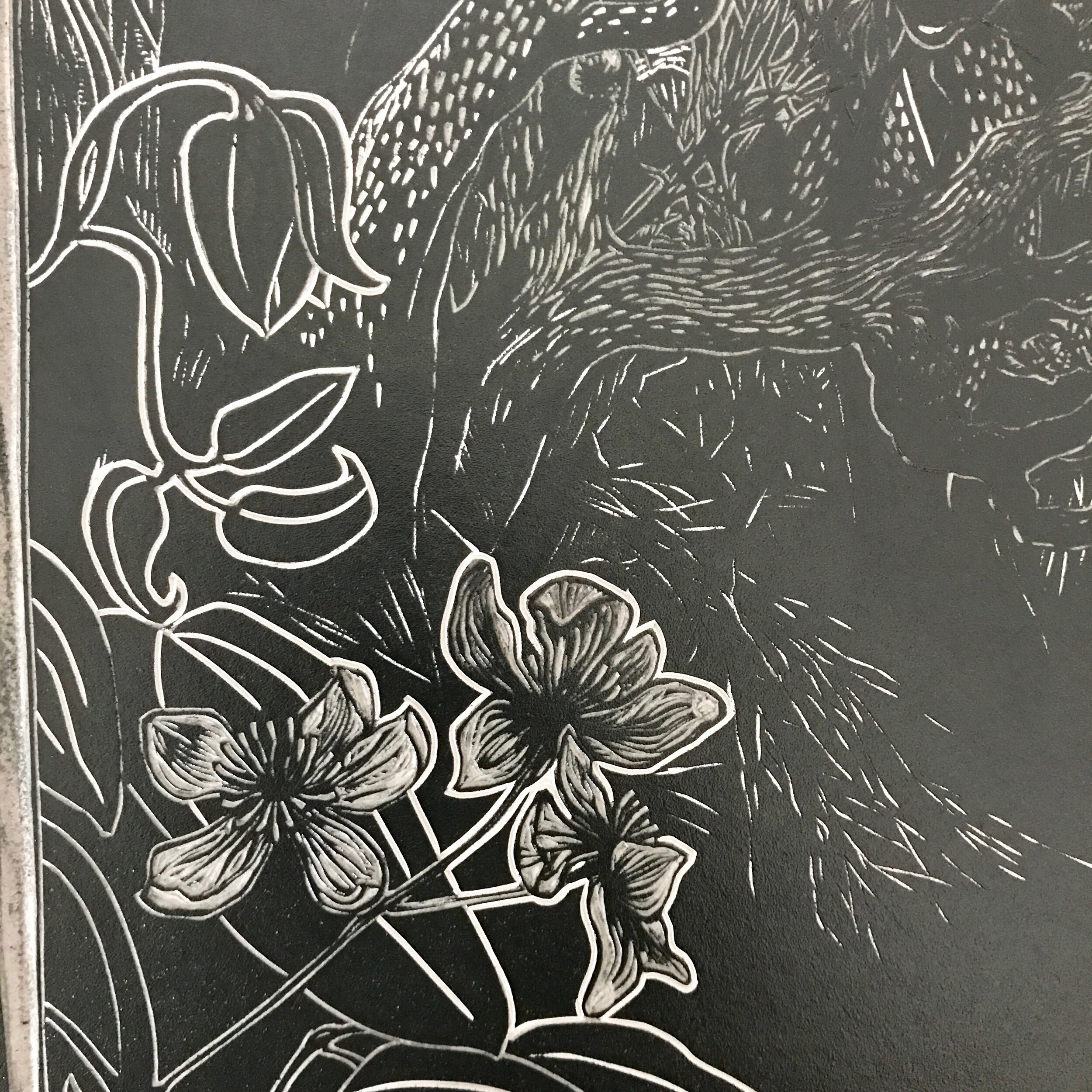
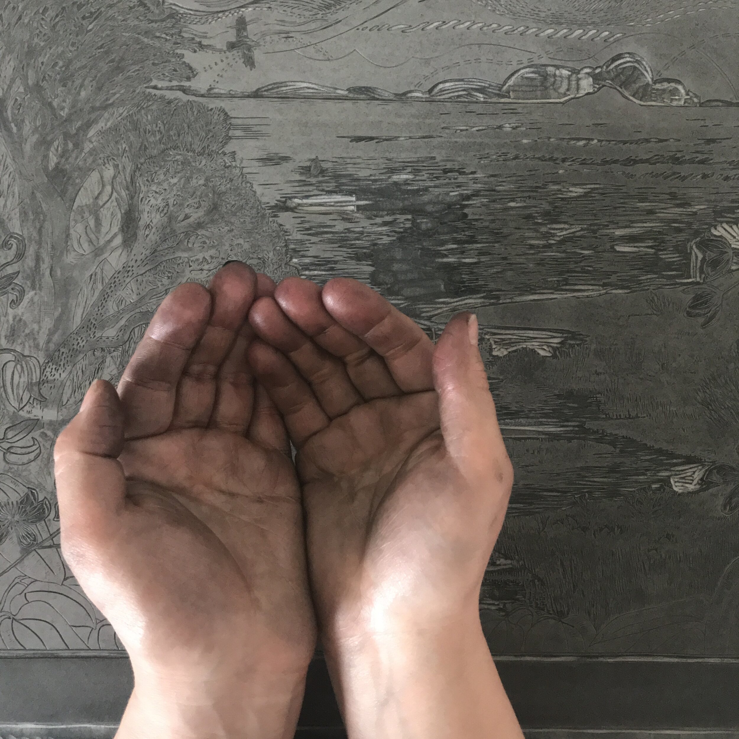
A commission to mark an extraordinary time in our lives, On the Cusp of the Tide was born from my client’s experience of lockdown in Victoria, Australia. It is also the largest block I have carved to date, and stretched my composition and detail carving to the full. Scroll down for work in progress photos, and our commission story.
Oil based ink on Japanese Hosho paper, edition of 20, printed area 40x40cm
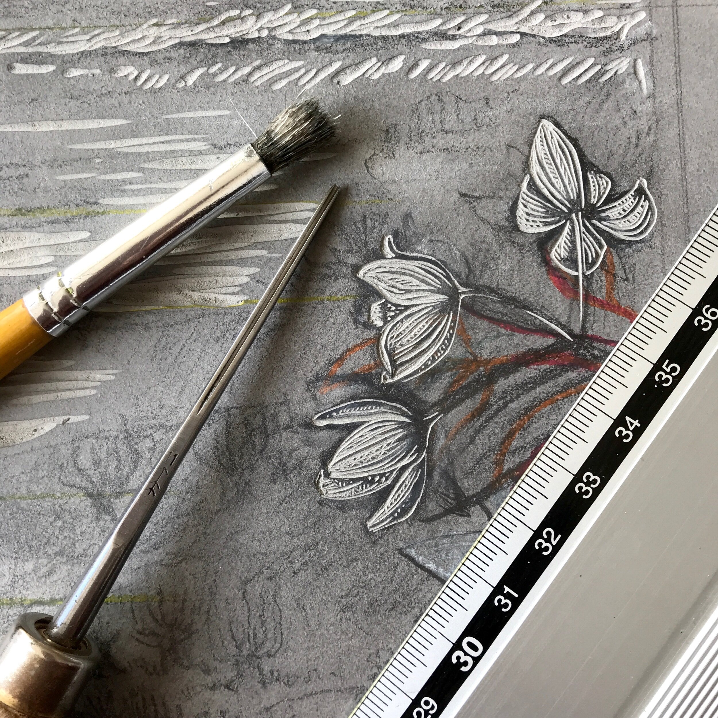
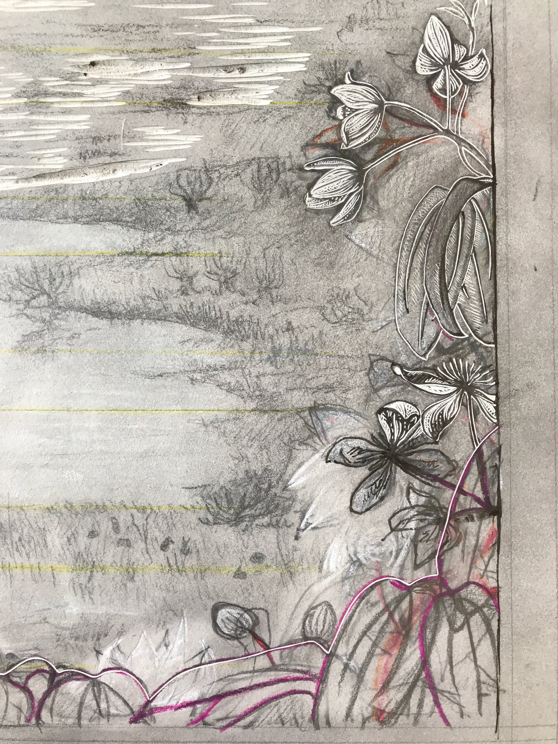
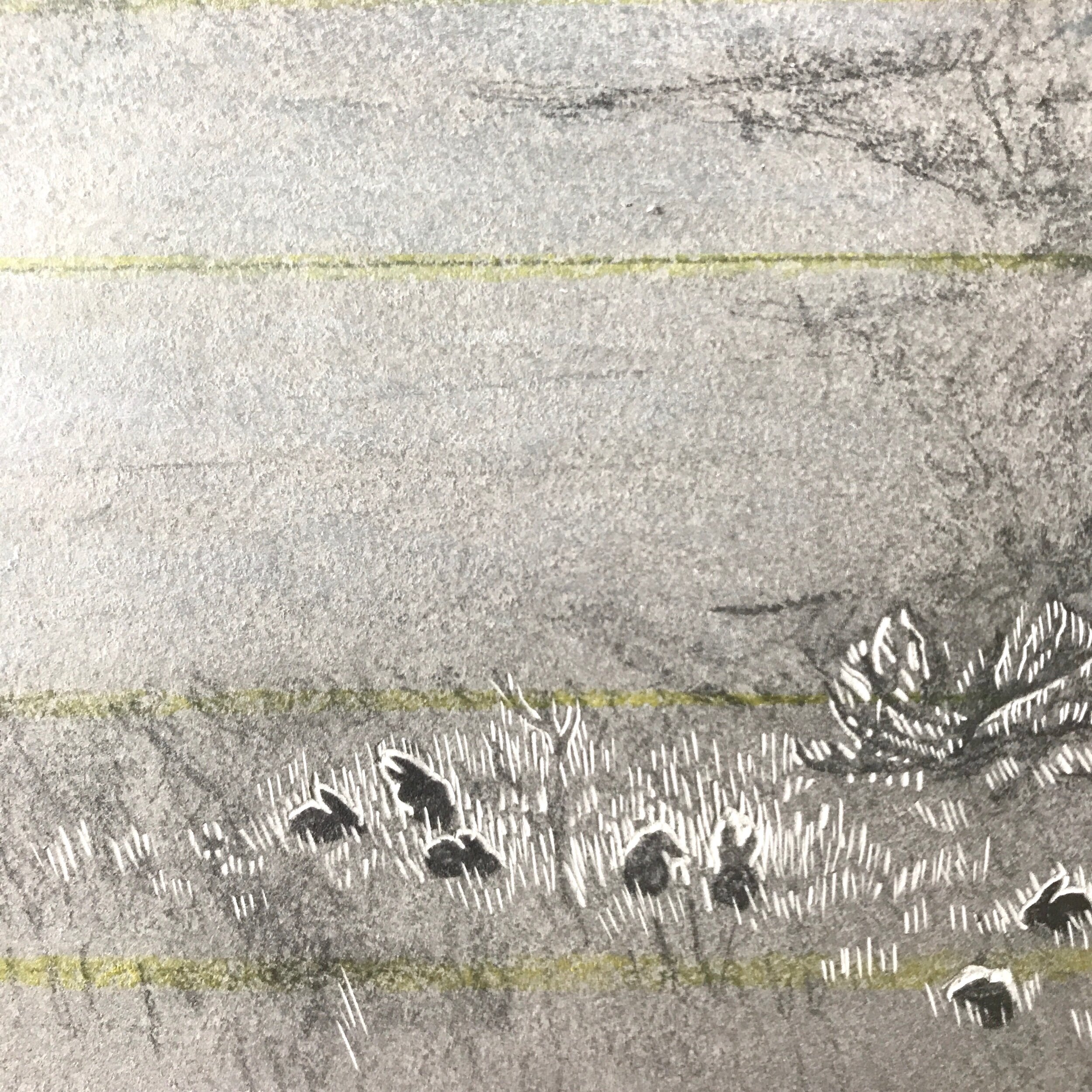
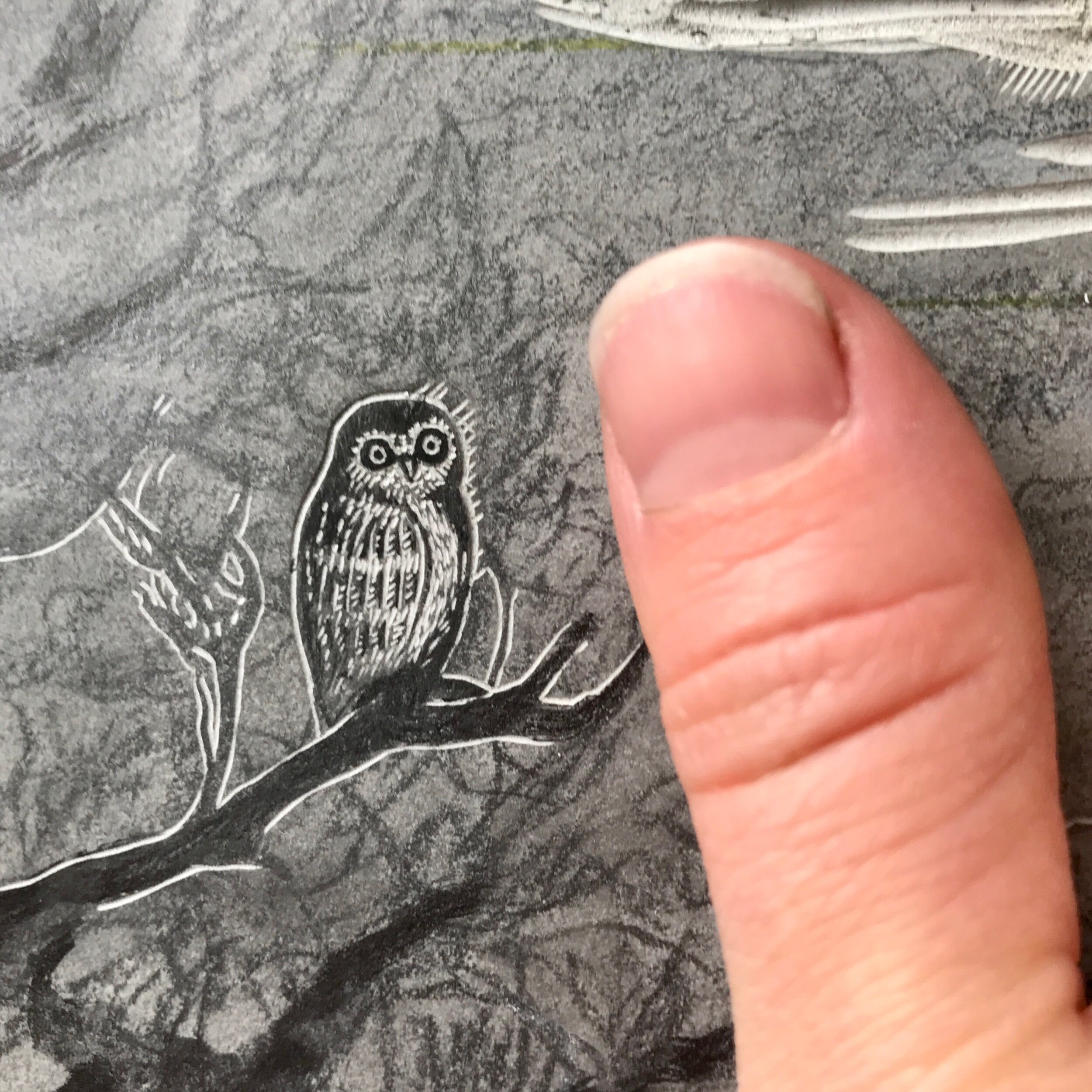
The Commission
The brief
With my client based on the opposite side of the world, and a full-scale pandemic raging, communication for this print was done entirely by email, with my client kindly providing me with photos of important features, people, animals and places.
The print was destined to hang in an alcove in a personal library, dictating its size and shape, and giving us a starting point of inspiration: books as windows into other worlds, as well as windows outside during one of the strictest lockdowns on the planet.
Other design thoughts included:
Water as a theme or a concept;
Connections between the inside and the outside, both physical and metaphysical;
Favourite animals and plants
The final design
This was my second design, and hit the nail on the head for my client immediately.
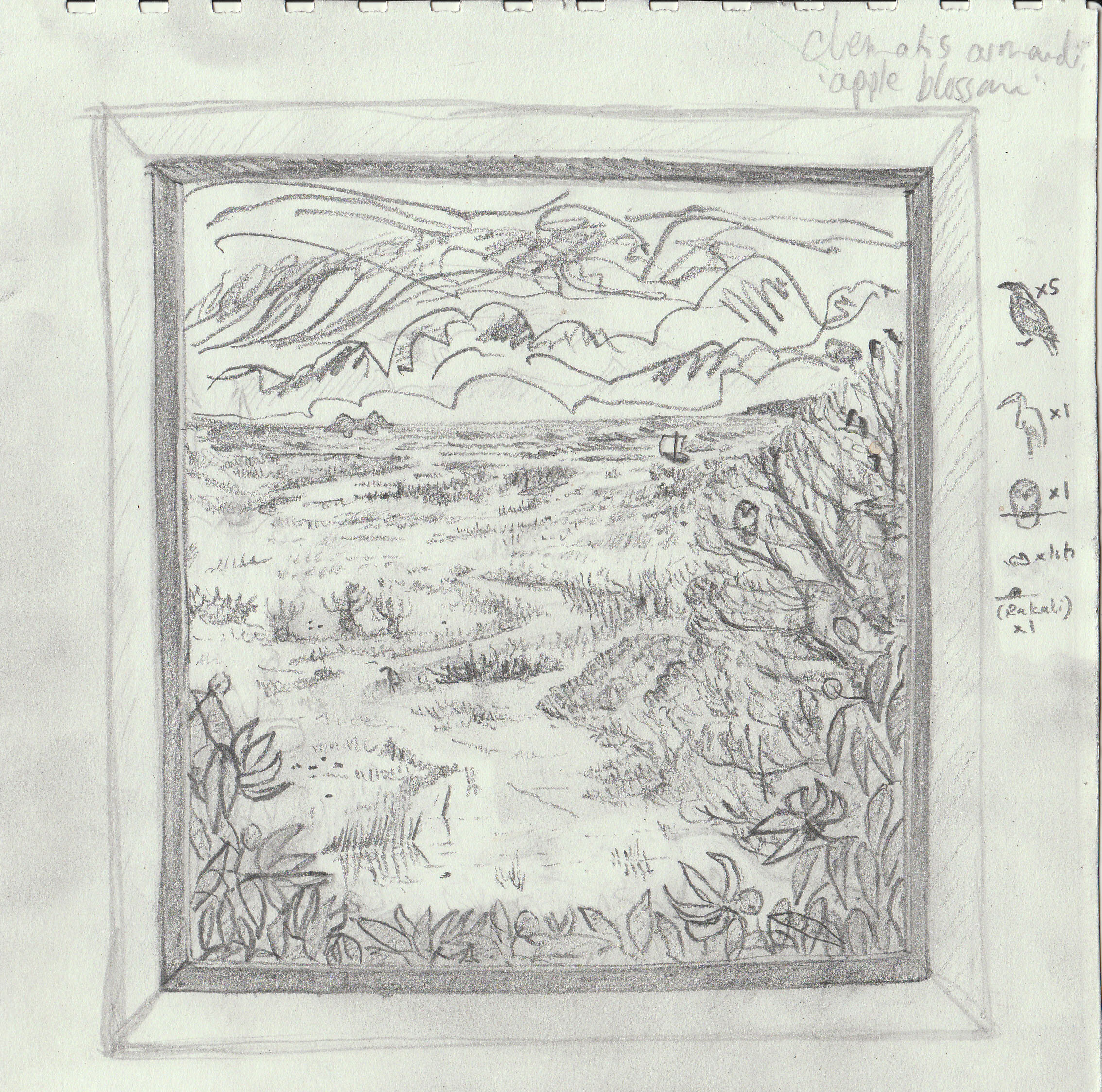
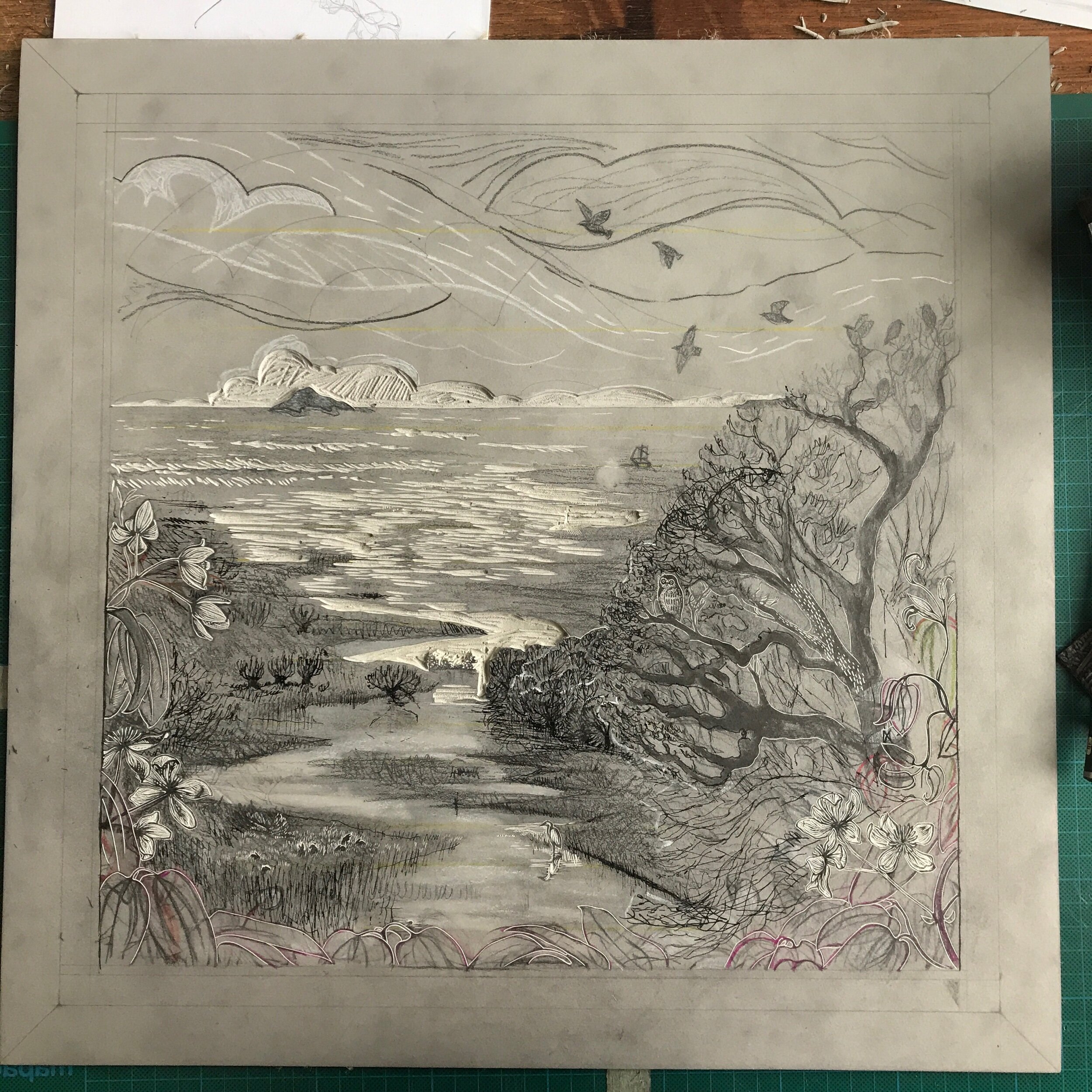
The drawn block
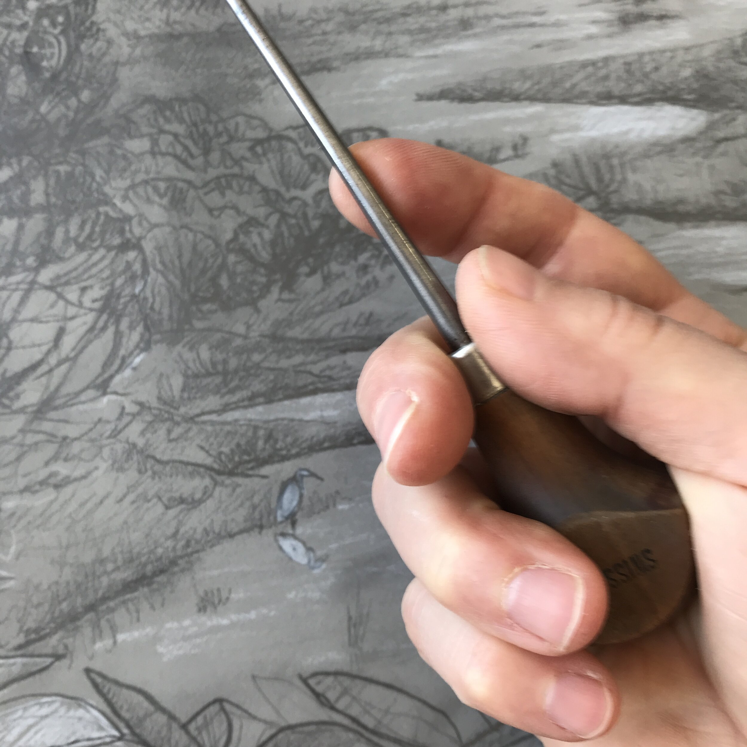
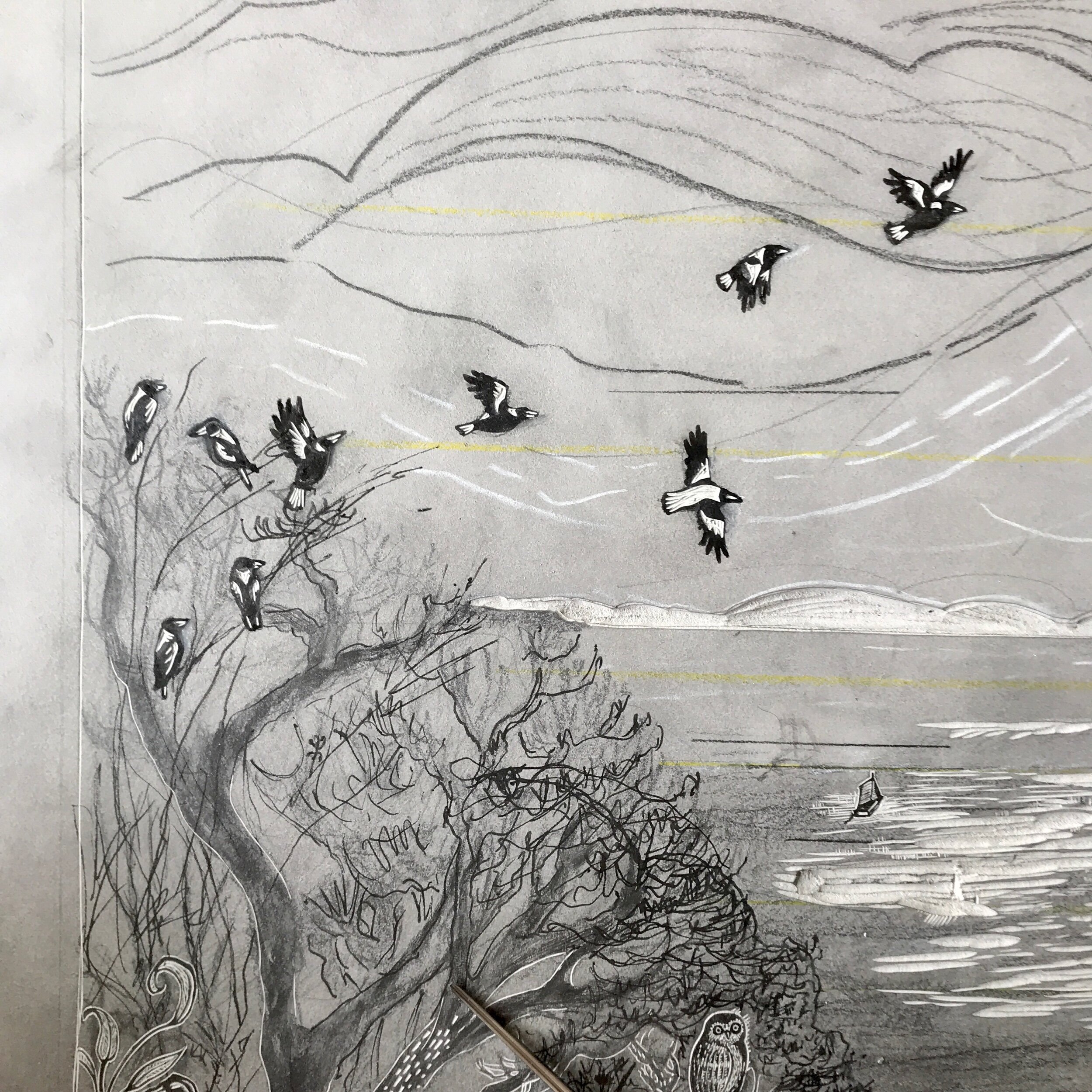
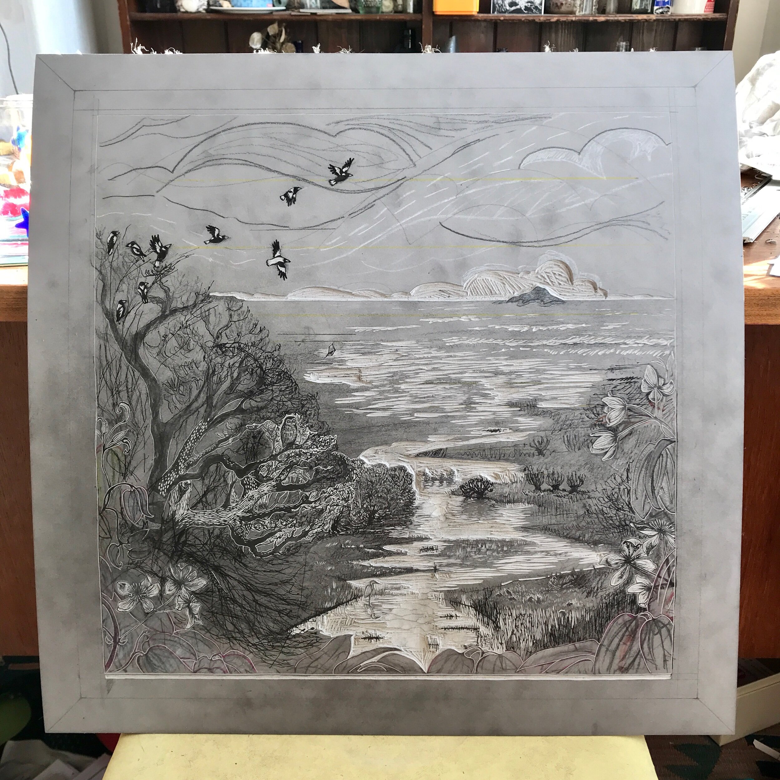
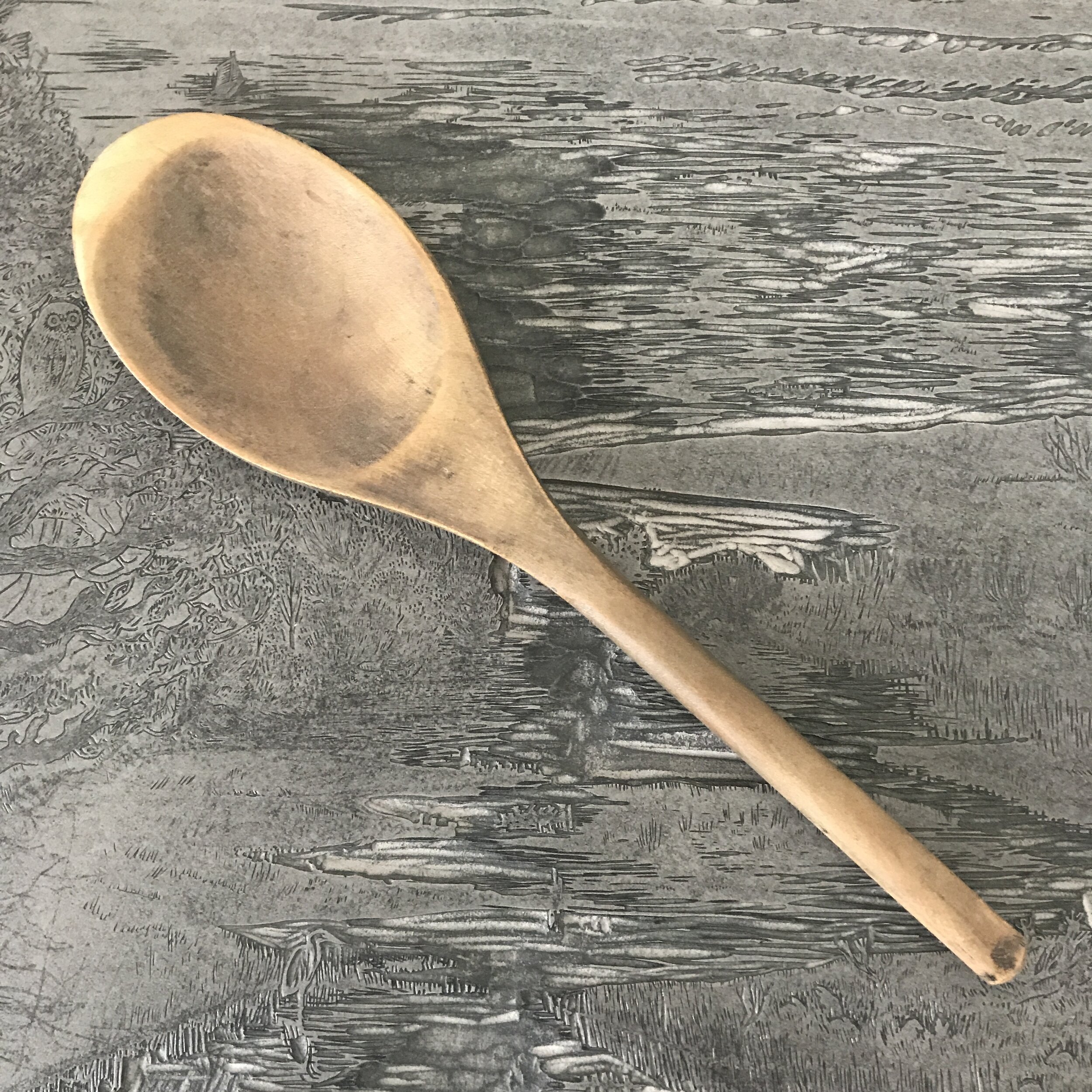
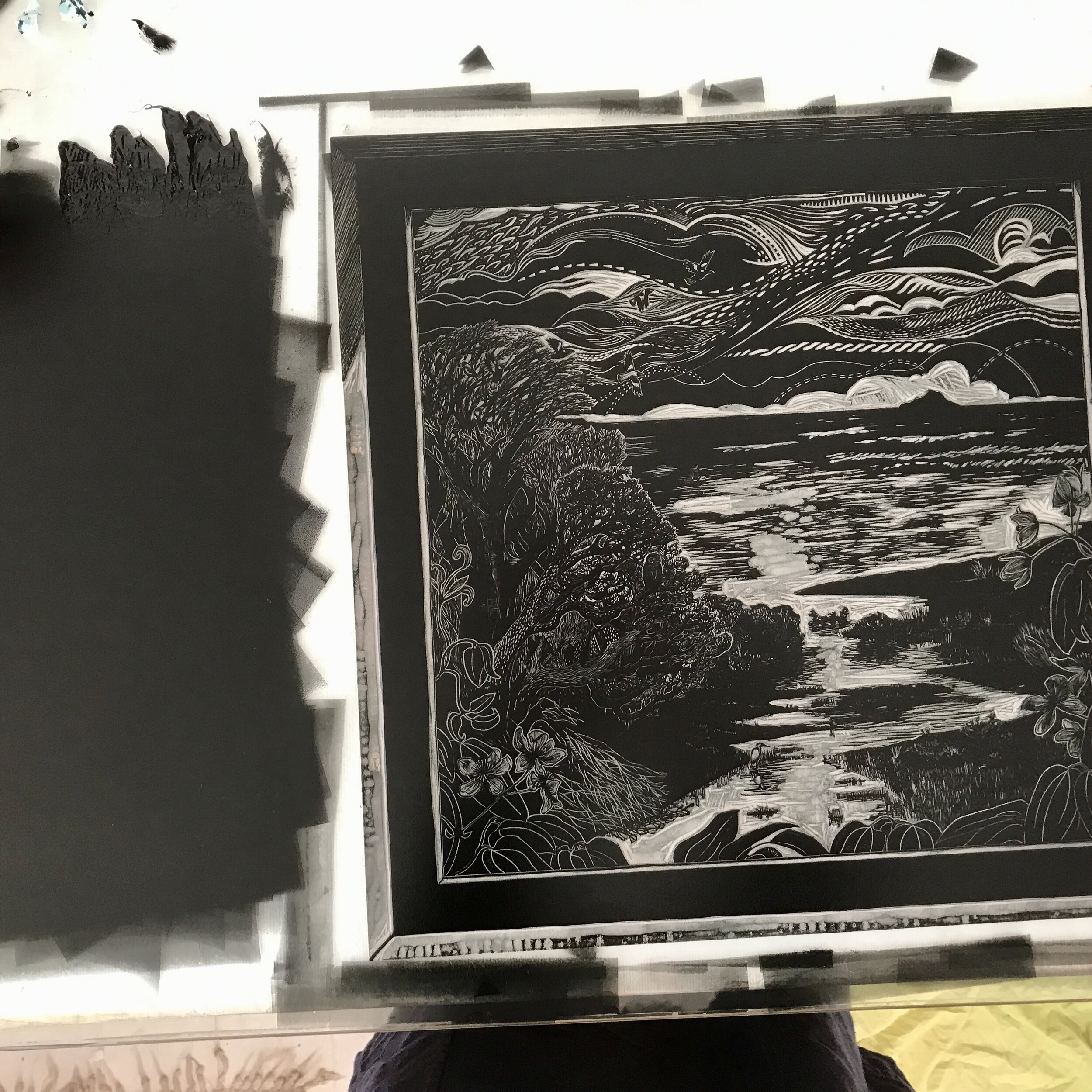
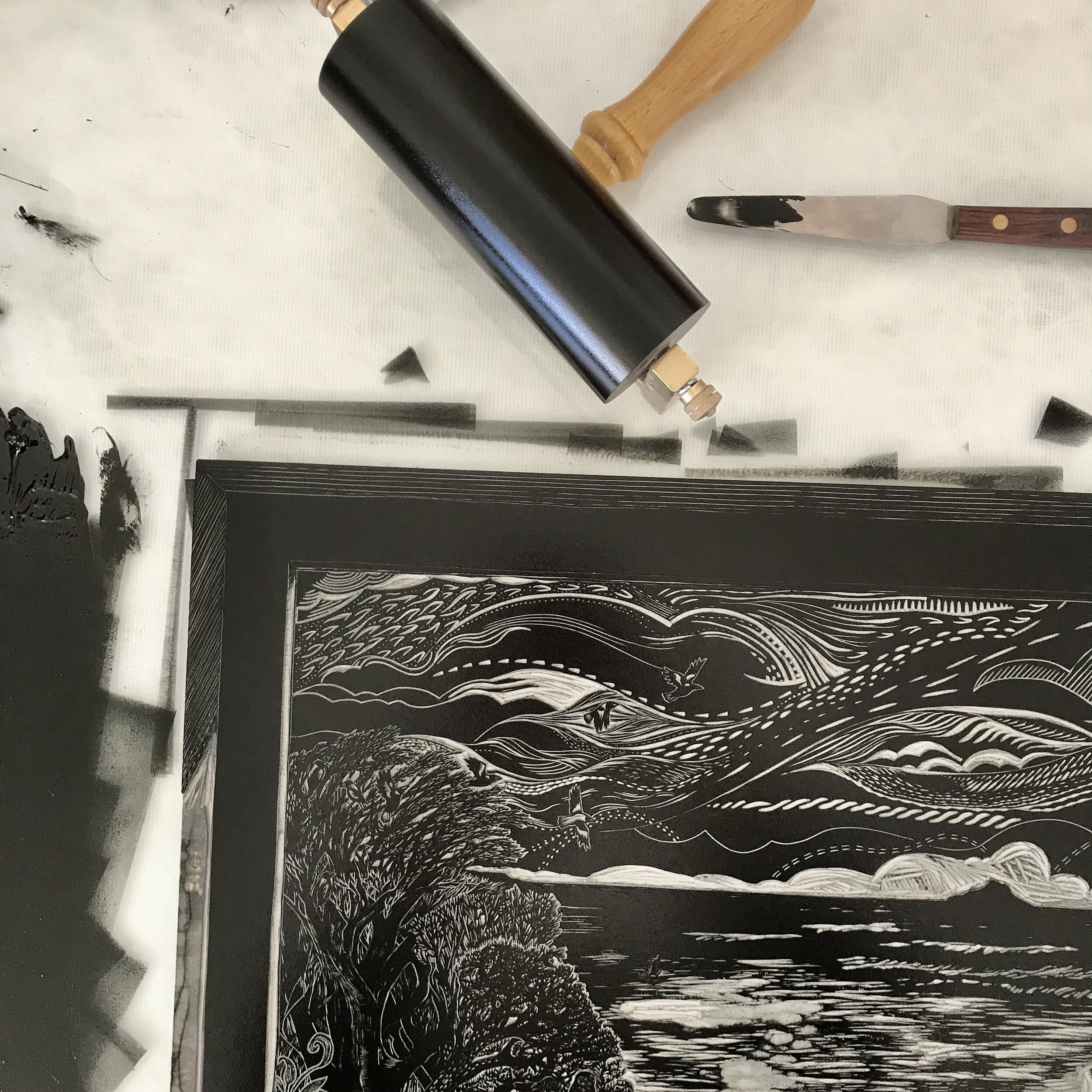
I drew the design onto the block, in preparation for beginning to carve. Relief prints are drawn and carved in reverse, so it looks backwards here.
Here is the viewpoint from a window, looking down onto the canal as it winds its way to the sea through a wetland landscape. The sea cliffs are off on the horizon line to the right.
The windowsill is bare to allow more space within the print for the view, and to enhance the feeling of being inside looking out.
The landscape is soft and chill: winter turning to spring, and the native flora has a pillowed, English feel to it, with beech, alder and willows growing in the wetland landscape. The wetland rushes, grasses and sedges unite Australia and the England in their wild mattedness, and speak more of a wild world than of a specific time and geographical place.
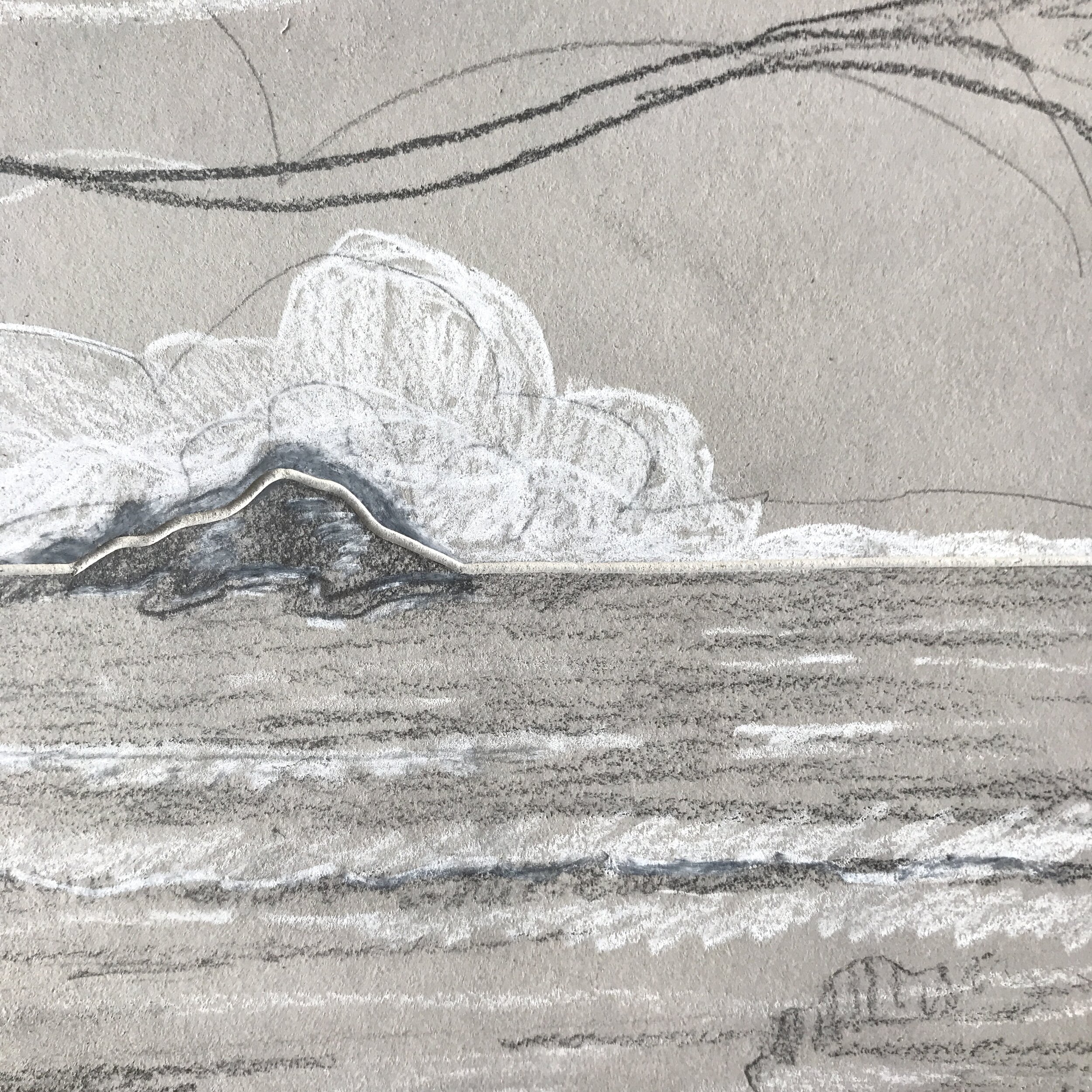
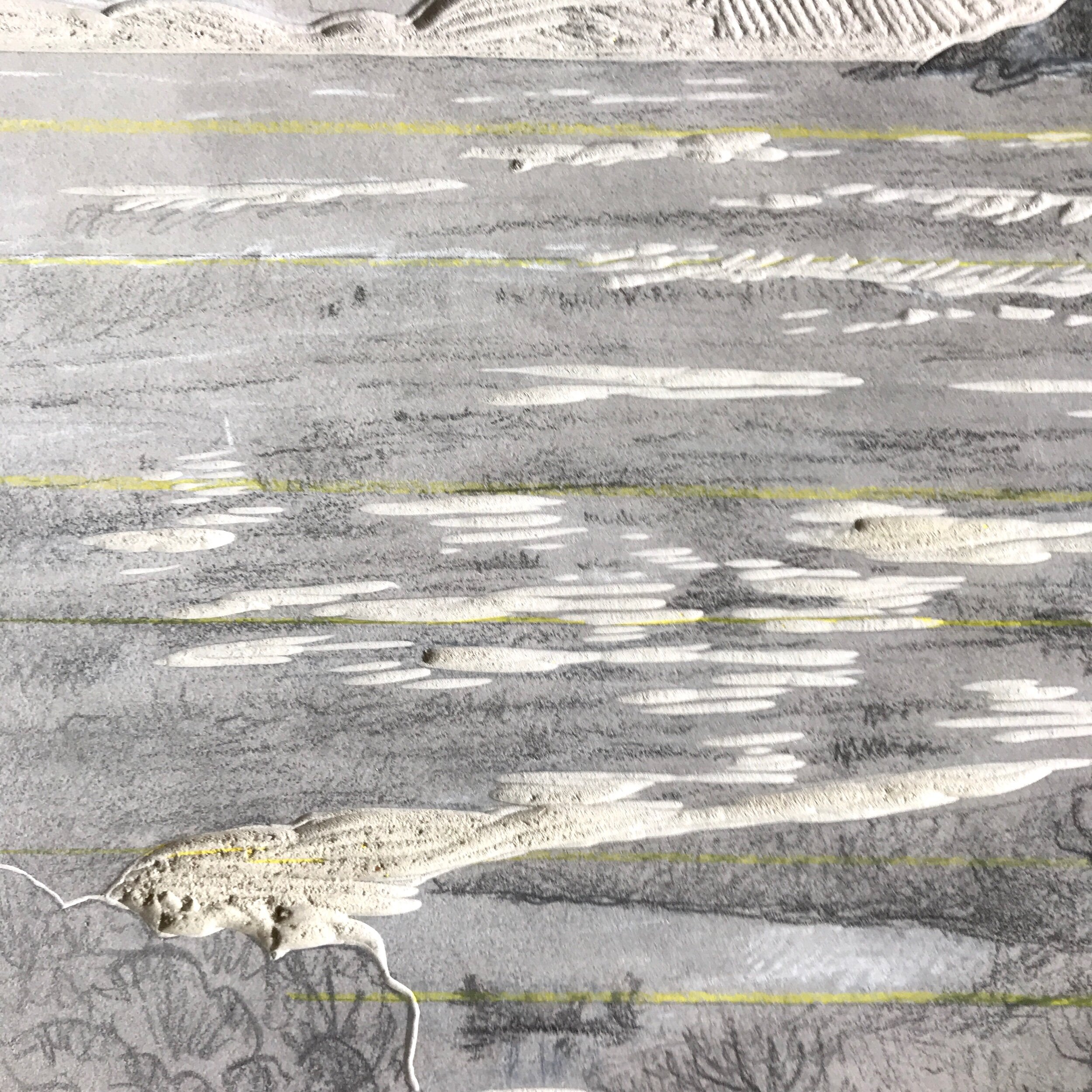
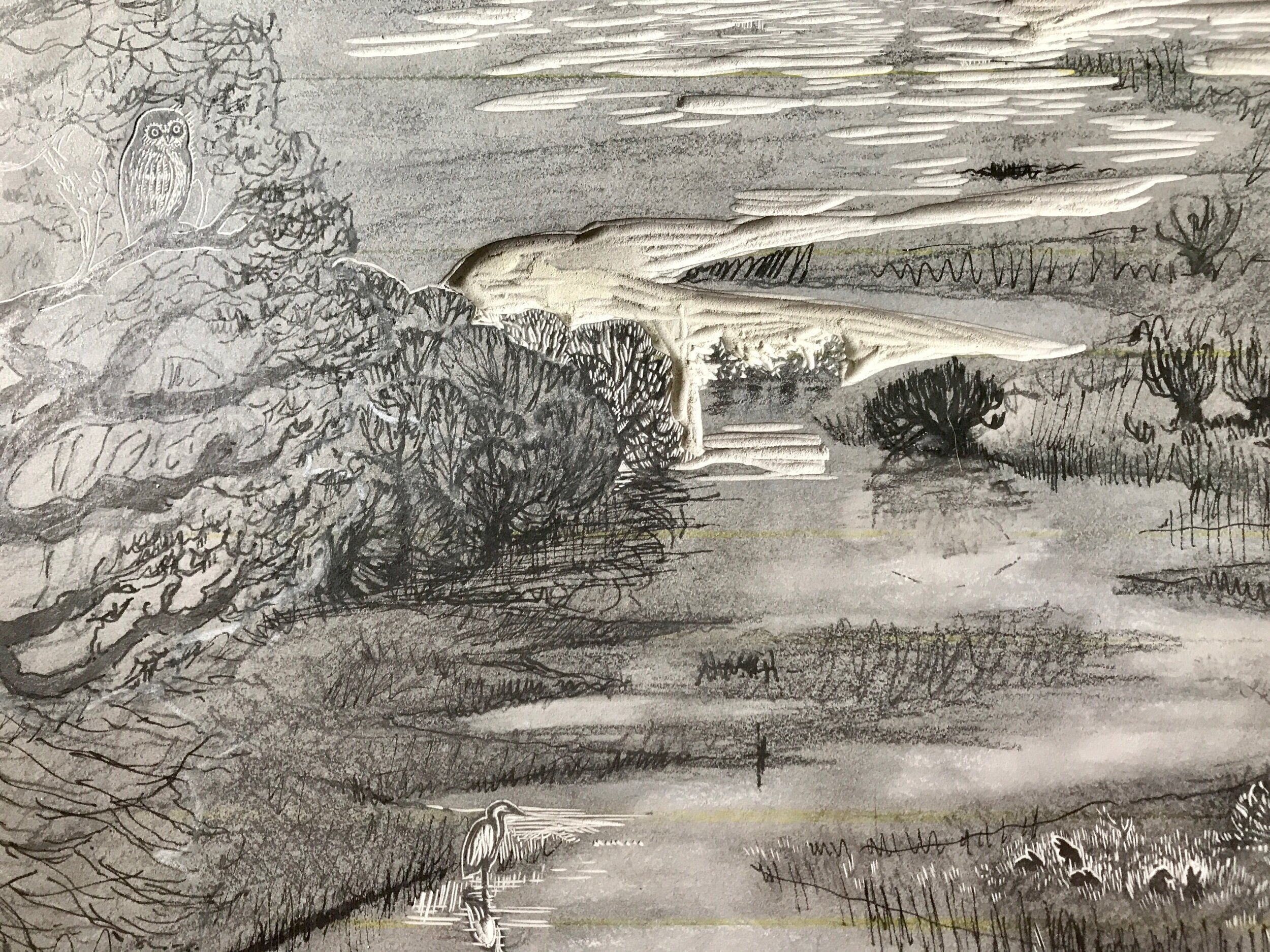
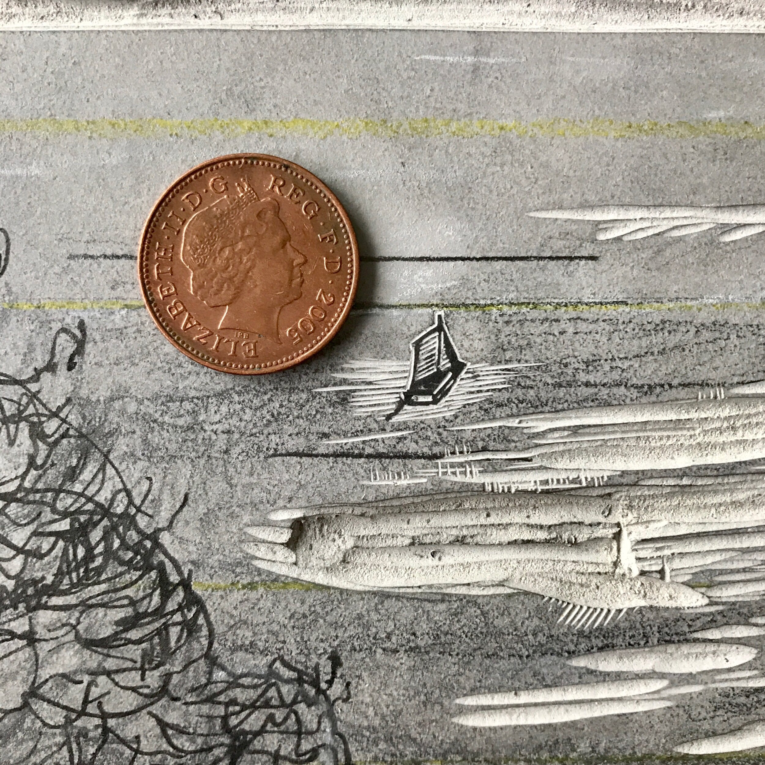
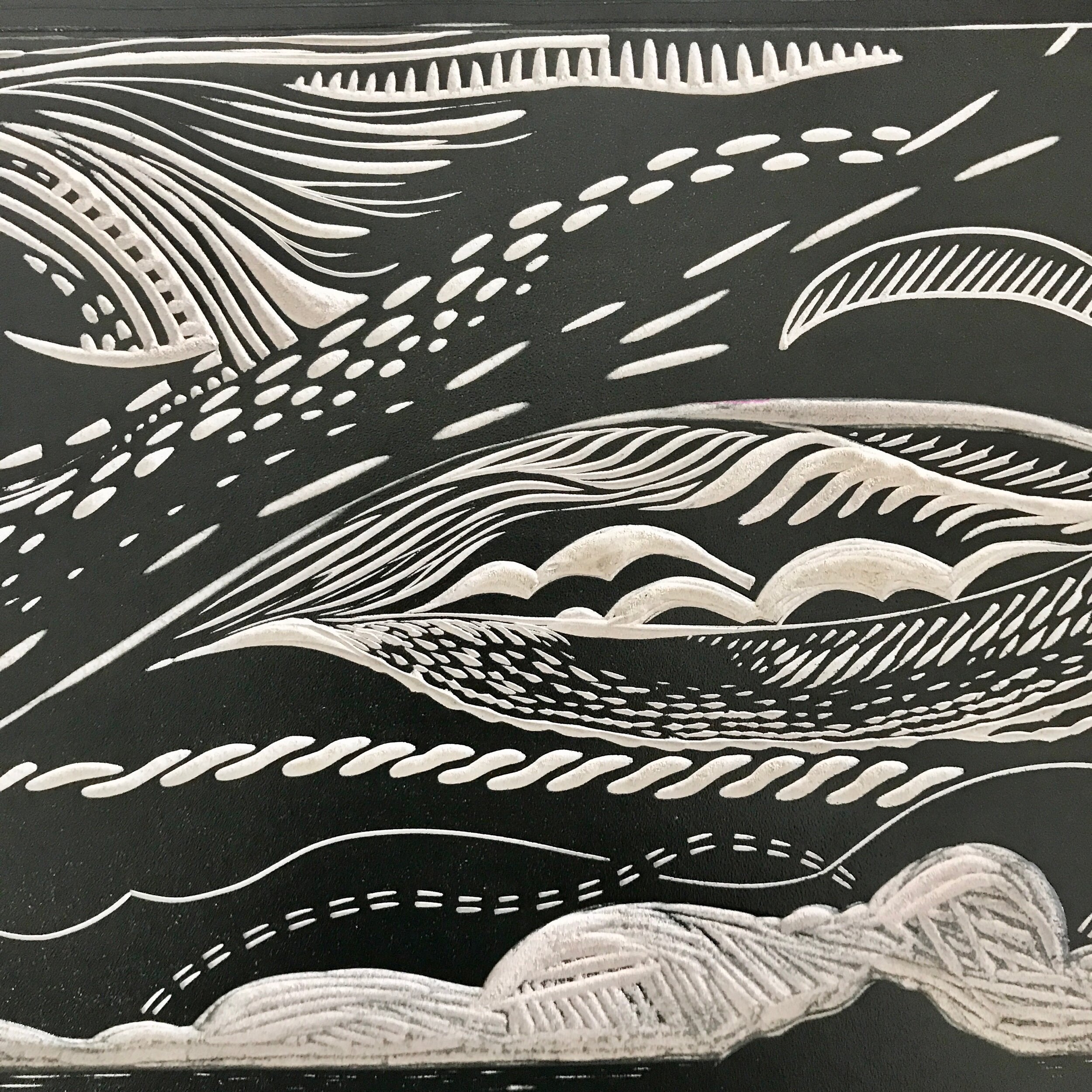
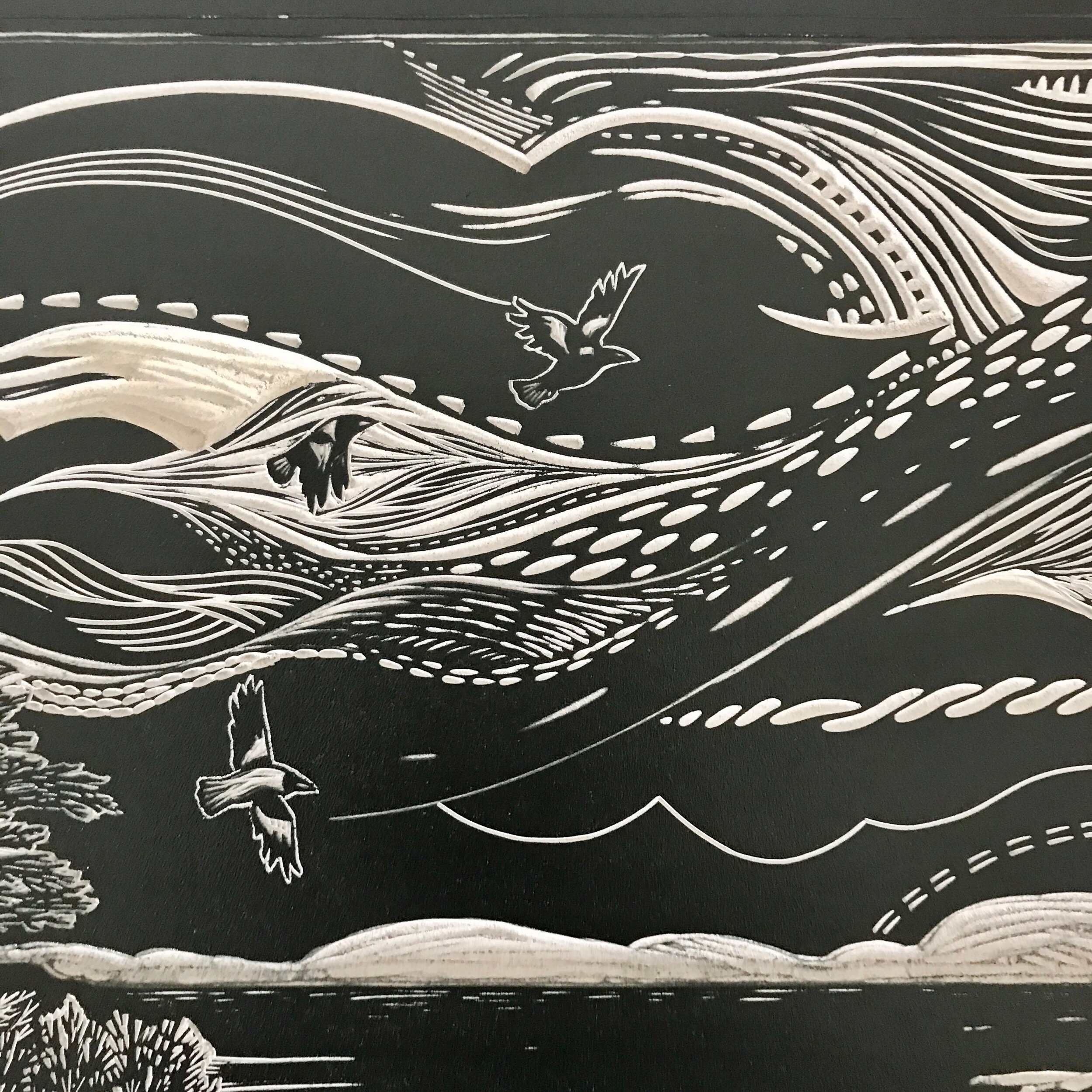
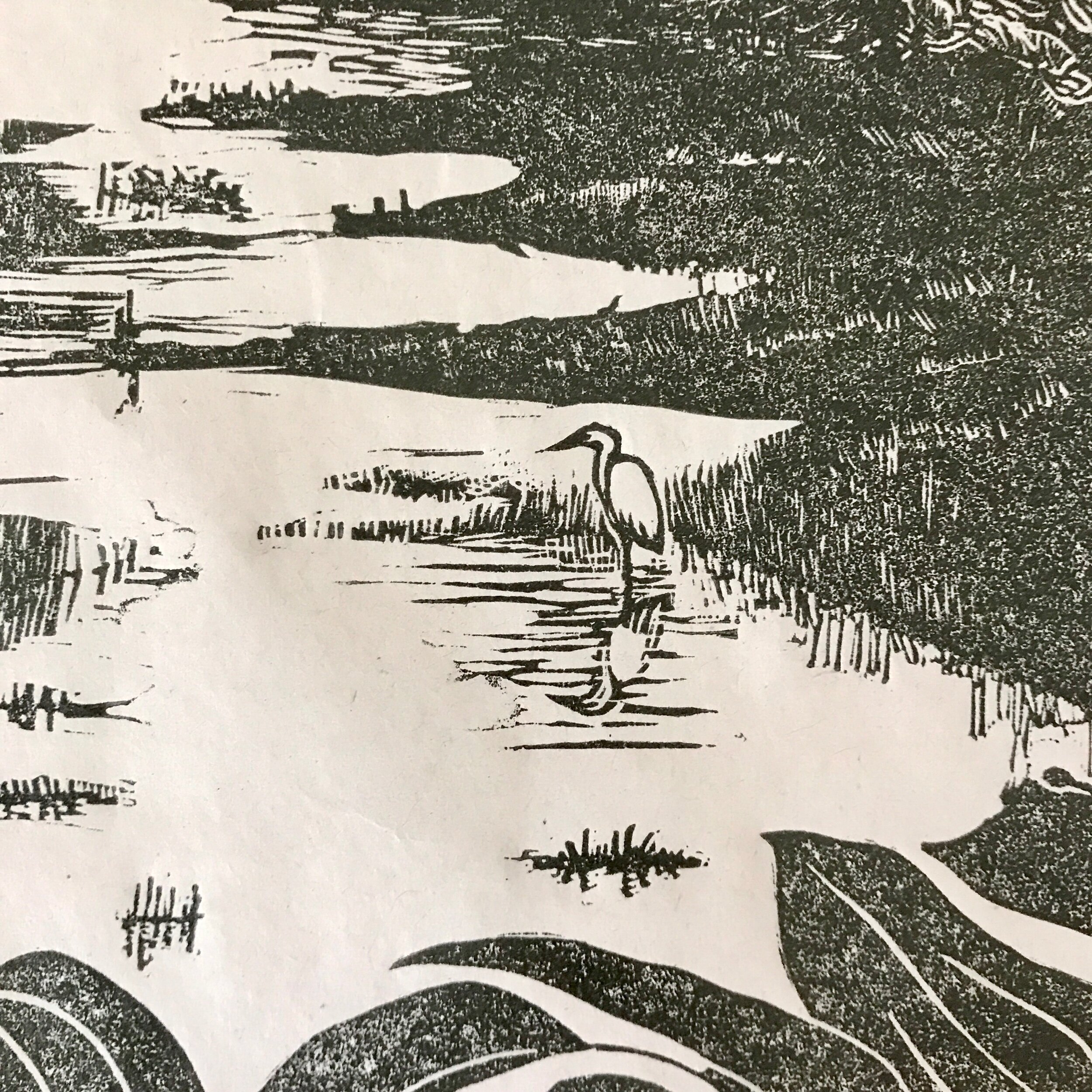
The boat bobs on the shoreline, and the island is in the distance, inviting adventure, and a step (albeit it a watery one) into the unknown. The horizon itself is backlit by a line of brightness, and the wind can be seen in the clouds which are building, vying with - yet balancing - the light reflecting off the water. Rushes and wetland plants reflect off the water, creating sharp contrasts. There is a blurred feel to the distinction between land and water in the middle distance: that liminal feeling of slipping from one to the other without being able to exactly see the join.
I spent a lot of time down at my local river, looking at how light plays on water, and revisited old sketches and photos of the sea whilst lockdown prevented me from visiting it personally.
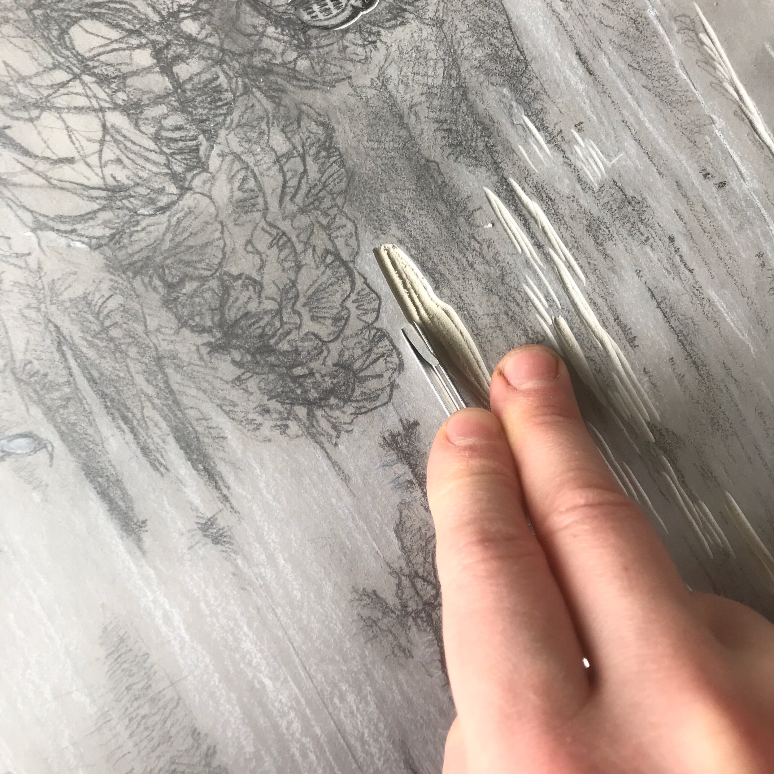
I aimed to bring out the interplay between light, water and land through mark making and negative spaces which I struggle to articulate with a pencil, but can achieve effortlessly in lino.
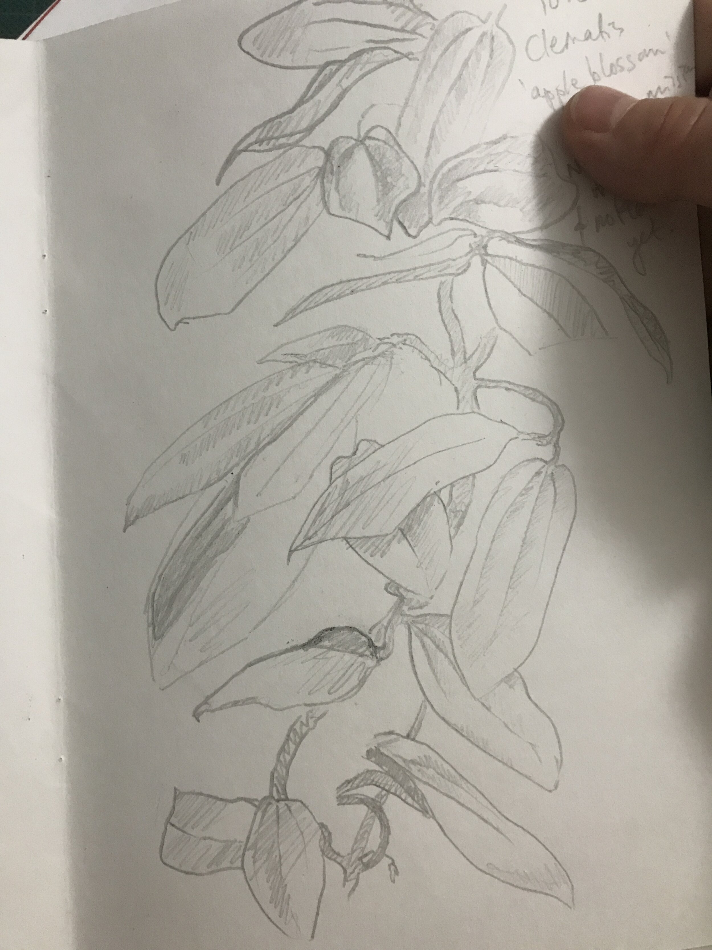
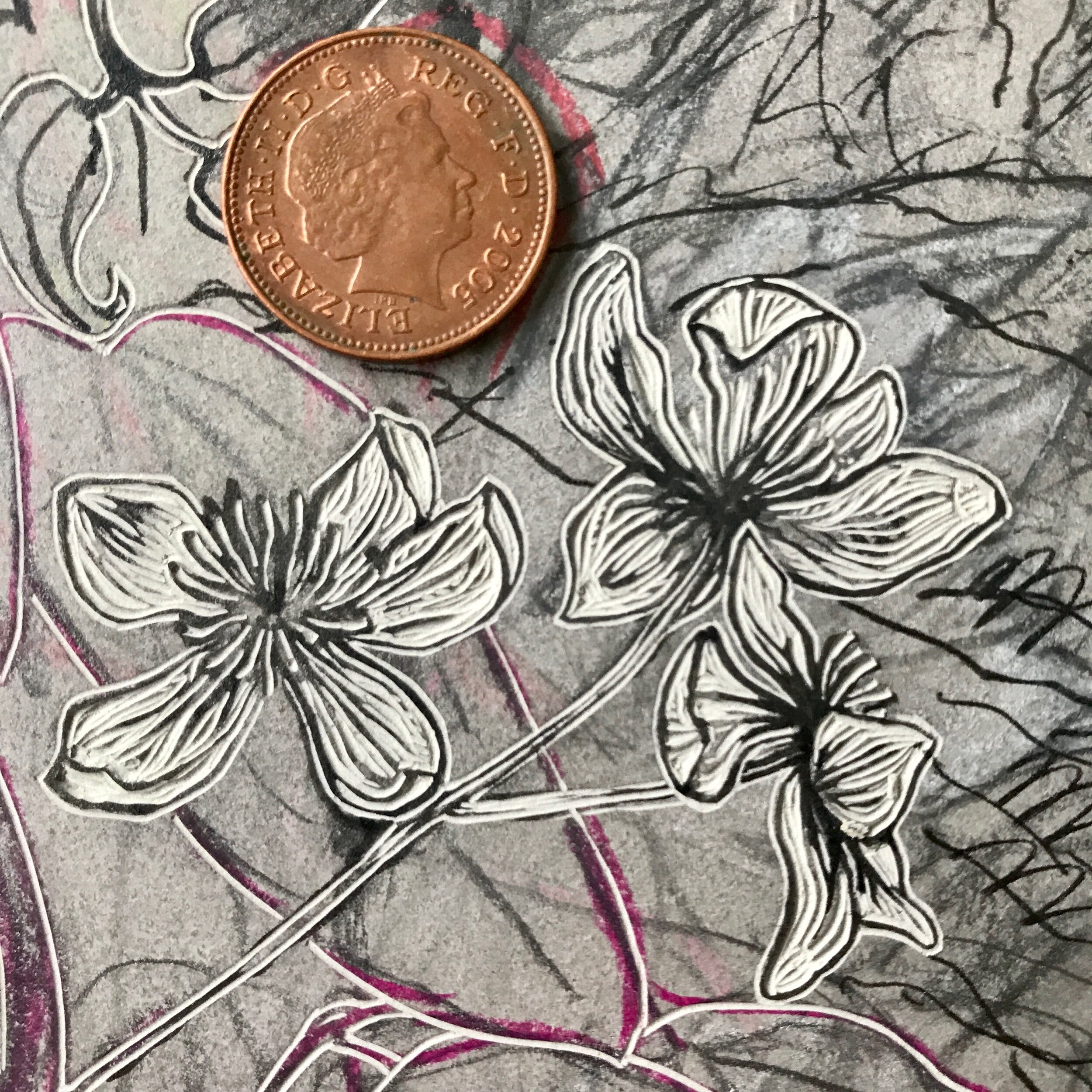
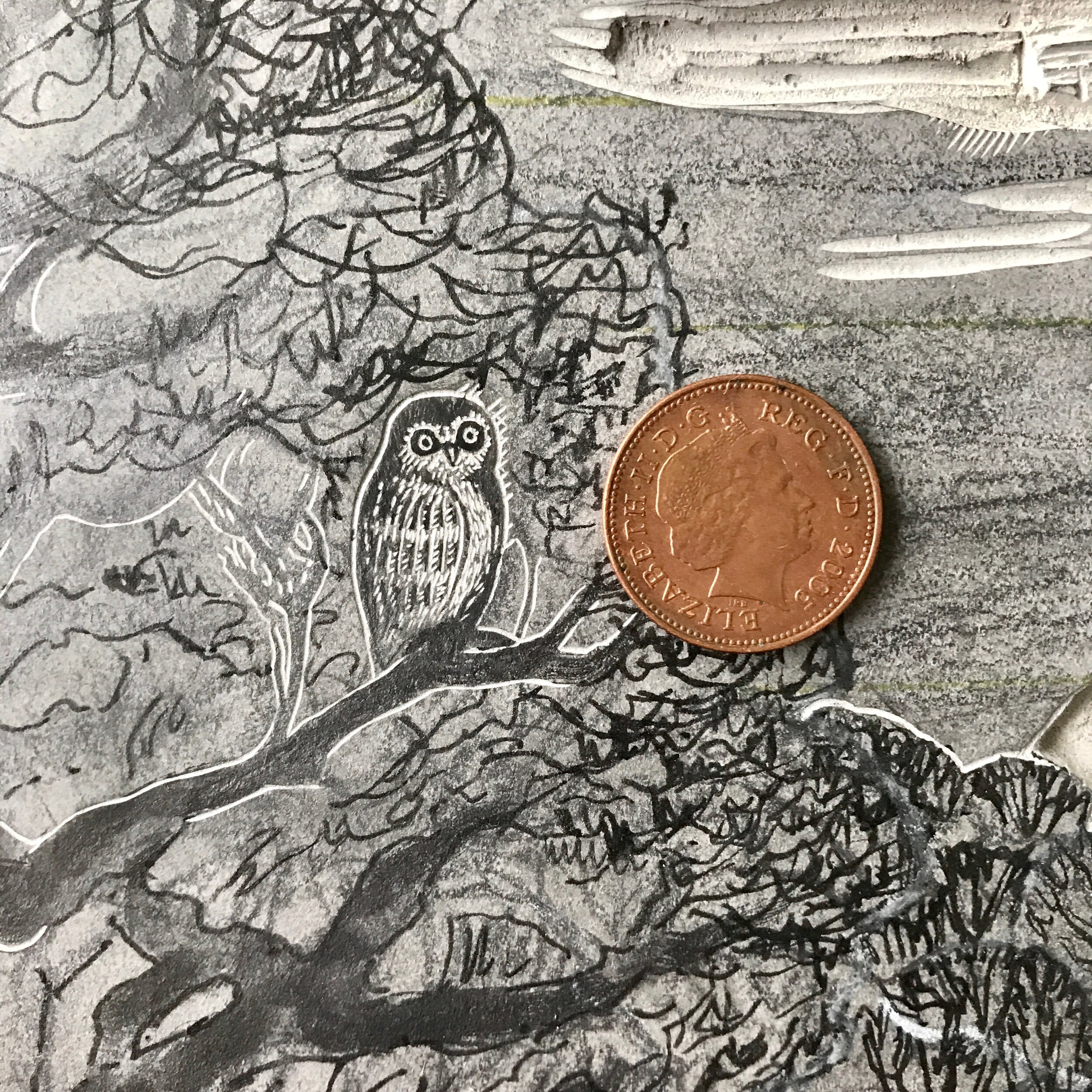
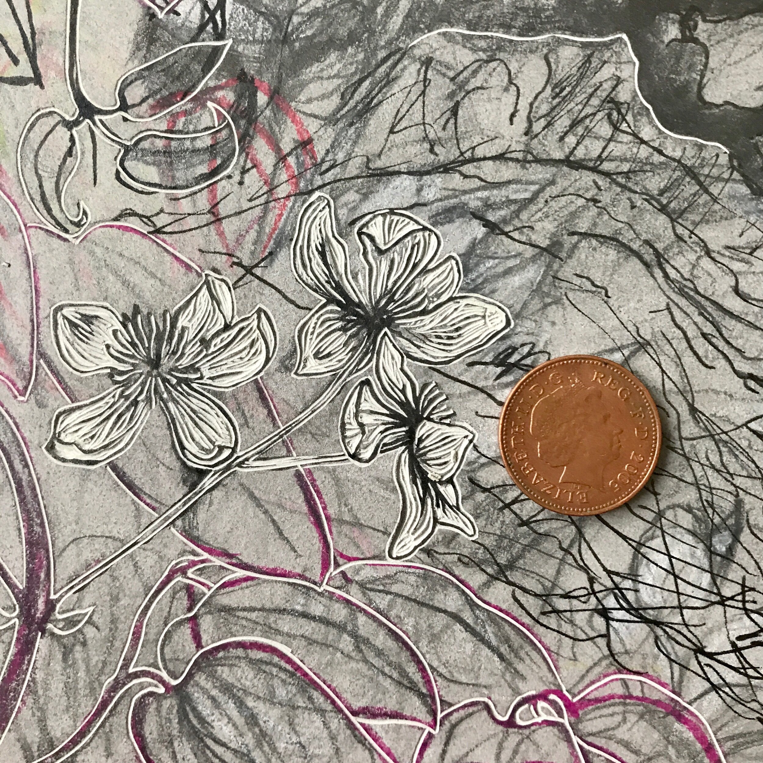
Literary references personal to my client are seen in the clematis C. armandii ‘Apple Blossom’ which grows under and partially up the sides of the window frame, the boat, the island and the feel of the scene as a whole.
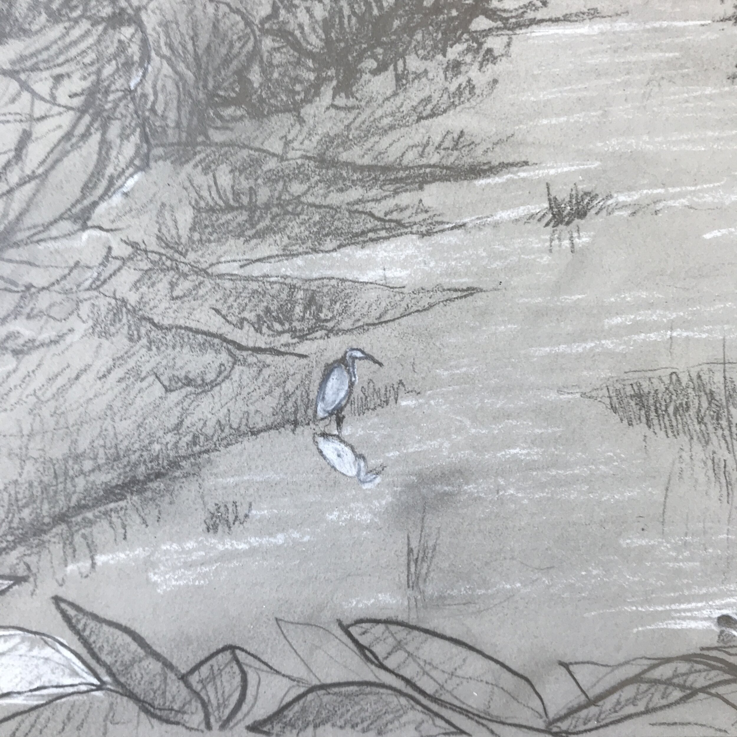
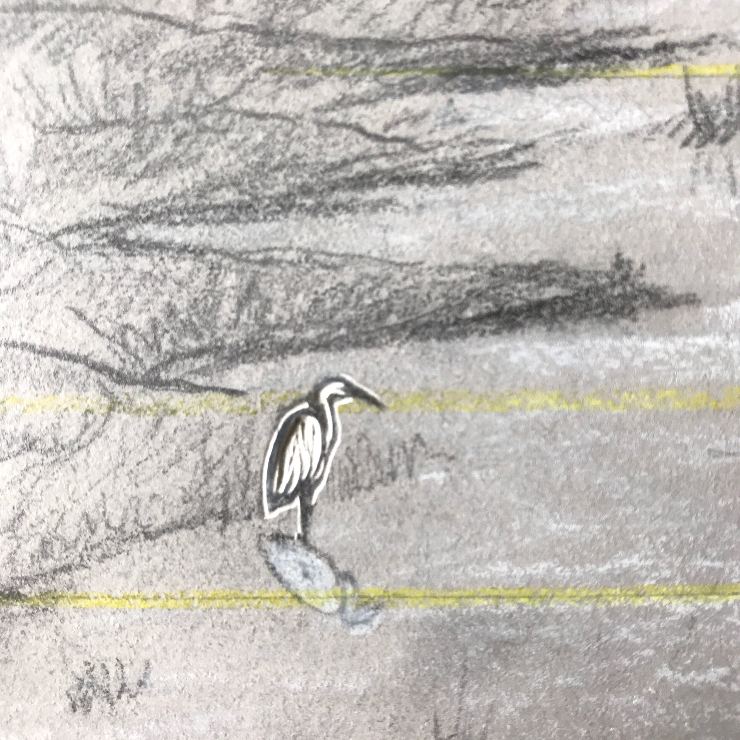
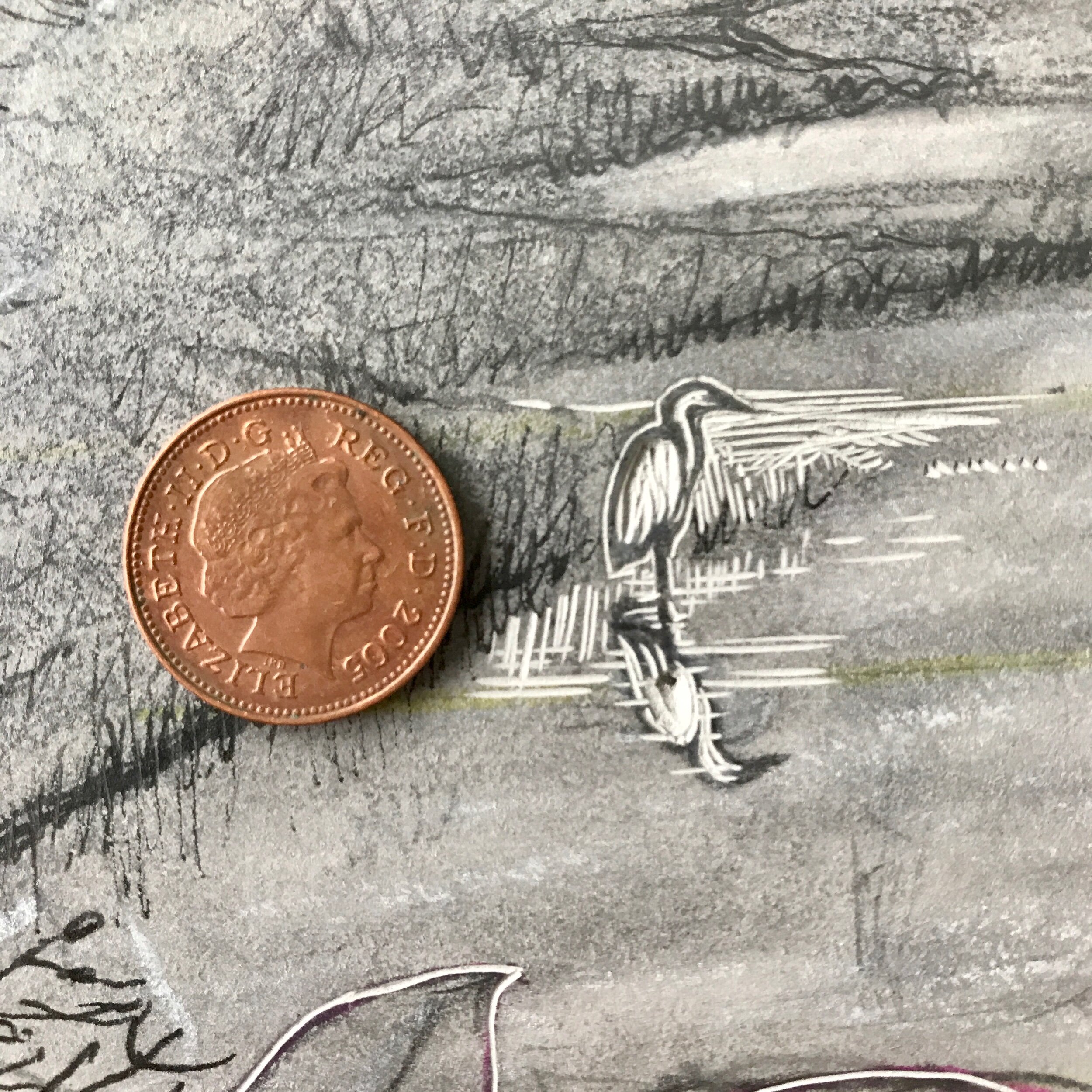
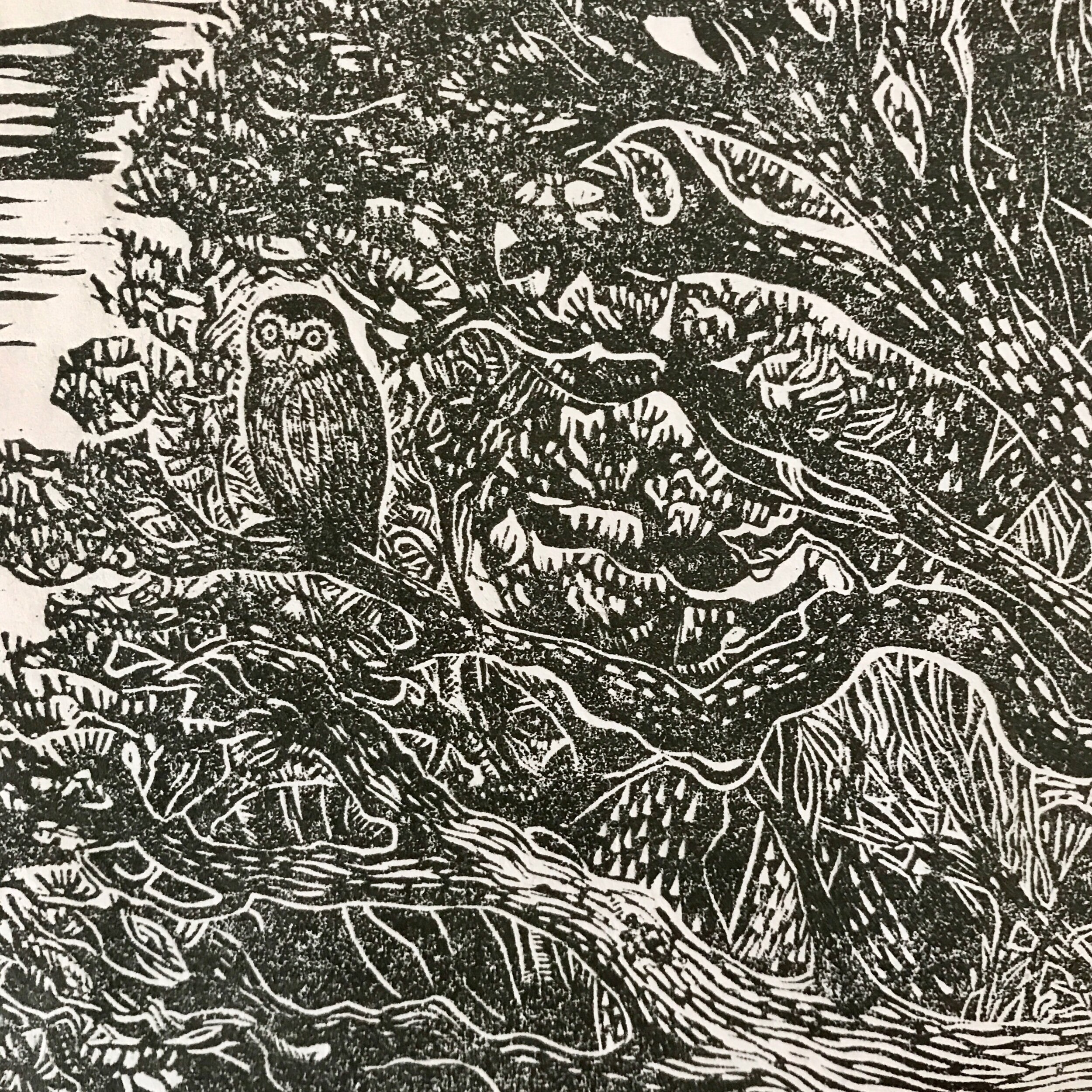
Animals with meaning and importance are also spread throughout the image, some more visible than others.
Choosing a Name
The final task was to choose a name. My client had some ideas, but asked me to make suggestions as well. We wanted to explain the liminal nature of the print, and the concept of change happening within blurred boundaries: light to dark, night to day, tide in to tide out, inside to outside, sea to sky: On the Cusp of the Tide


